

GfSA. München
A new visual identity and digital system for a growing social organisation.
Gesellschaft für Soziale Arbeit München is a nonprofit organisation supporting social services across Munich.
I shaped its visual identity and built a flexible design system across branding, digital, print and accessibility.
- Role:
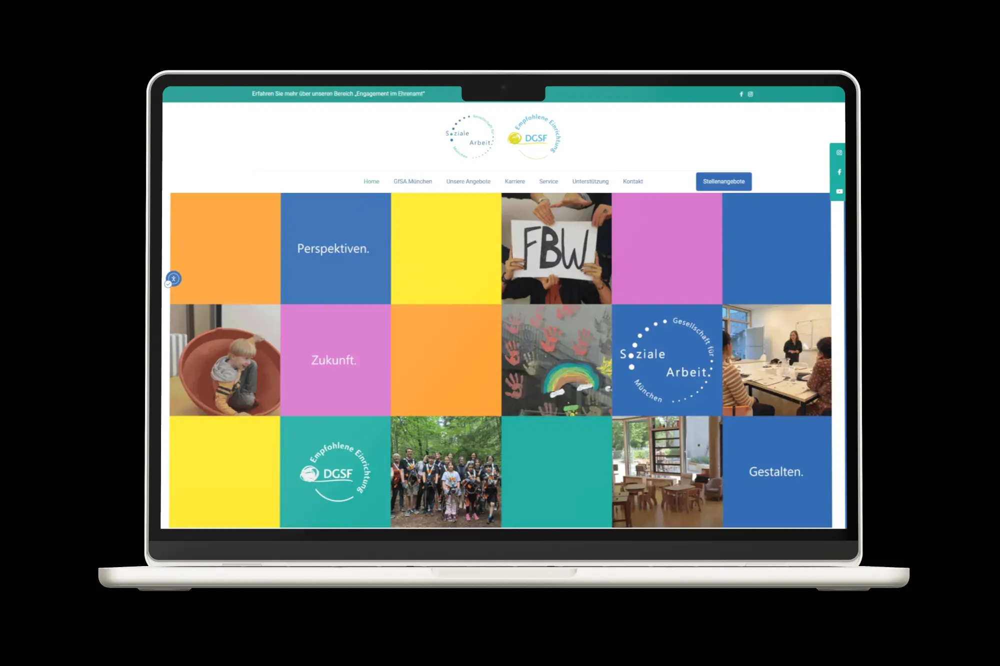
I developed the visual identity and design system across digital and print, including the website, accessibility, event tools, publications, materials and team training.
- Deliverables:
Brand Identity · Website · Design System · Print & Editorial · Event Materials · Social Media · WordPress Training
- Timeline:
2022 - Present
Building a new Brand.
A look at the key decisions behind the rebrand - from refining the identity to creating a flexible visual language.
01. The Starting Point
A functional identity, tied to a growing network.
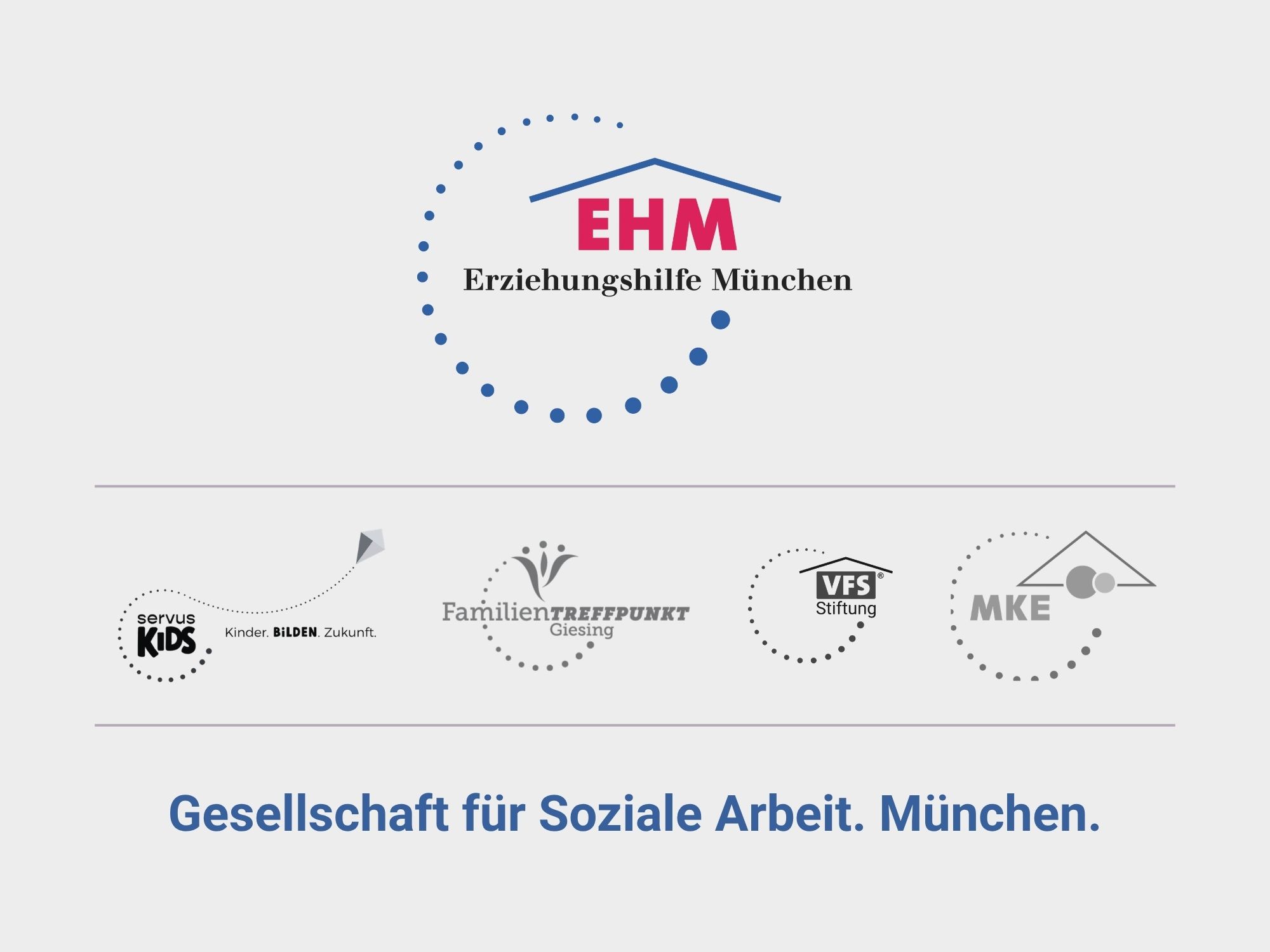
The organisation was previously known as EHM – Erziehungshilfe München. As it expanded, it rebranded under a new name: Gesellschaft für Soziale Arbeit.
The brief came with one clear requirement: the new logo had to keep the navy blue colour and the dot motif – both already recognised across the organisation’s network of sub-brands, including servus KiDS, FamilienTREFFPUNKT Giesing, VFS, KIT and others.
Typography needed to stay highly readable, in line with accessibility needs. Beyond that, the brand had to feel fresh, modern, friendly and professional – approachable enough for the communities it serves, credible enough for its partners and funders.
02. Exploring Directions
Staying in the circle, testing how far it could go.
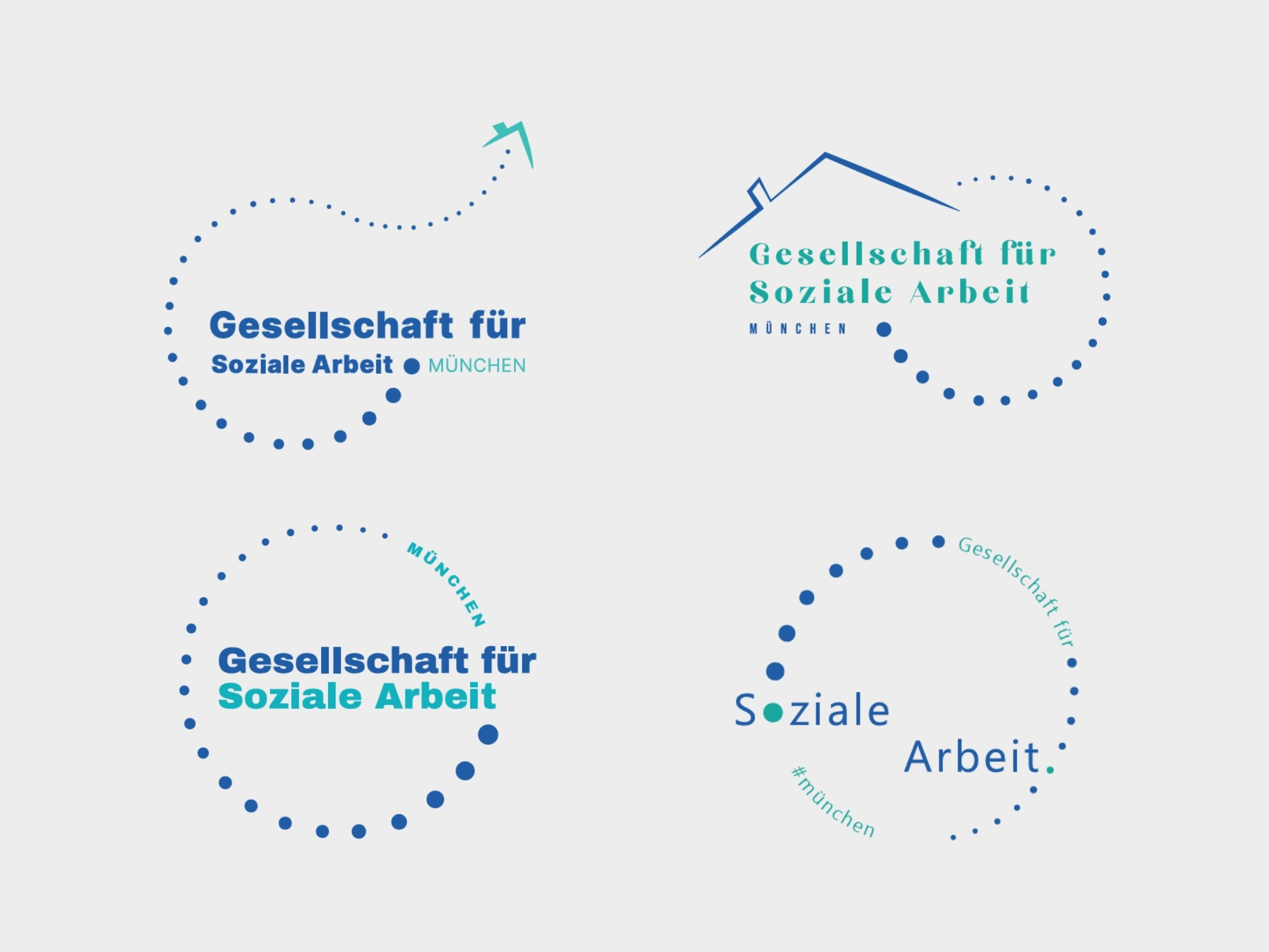
Working within the dot-motif constraint, I explored several directions – all keeping the circular dot arrangement, but testing different ways to integrate it with the new name. One direction (top left) was inspired by servus KiDS’ existing mark, pushing a dot trail beyond the circle to add movement. Others tested a more literal nod to the old EHM roofline (top right), a simplified typographic approach with the circle as a supporting frame (bottom left), and a version integrating the dot directly into the wordmark itself (bottom right).
The client responded most strongly to the fourth direction: the dot-integrated wordmark felt the most distinctive while still reading clearly as part of the same visual family. This became the starting point for the final logo.
03. The Final Logo
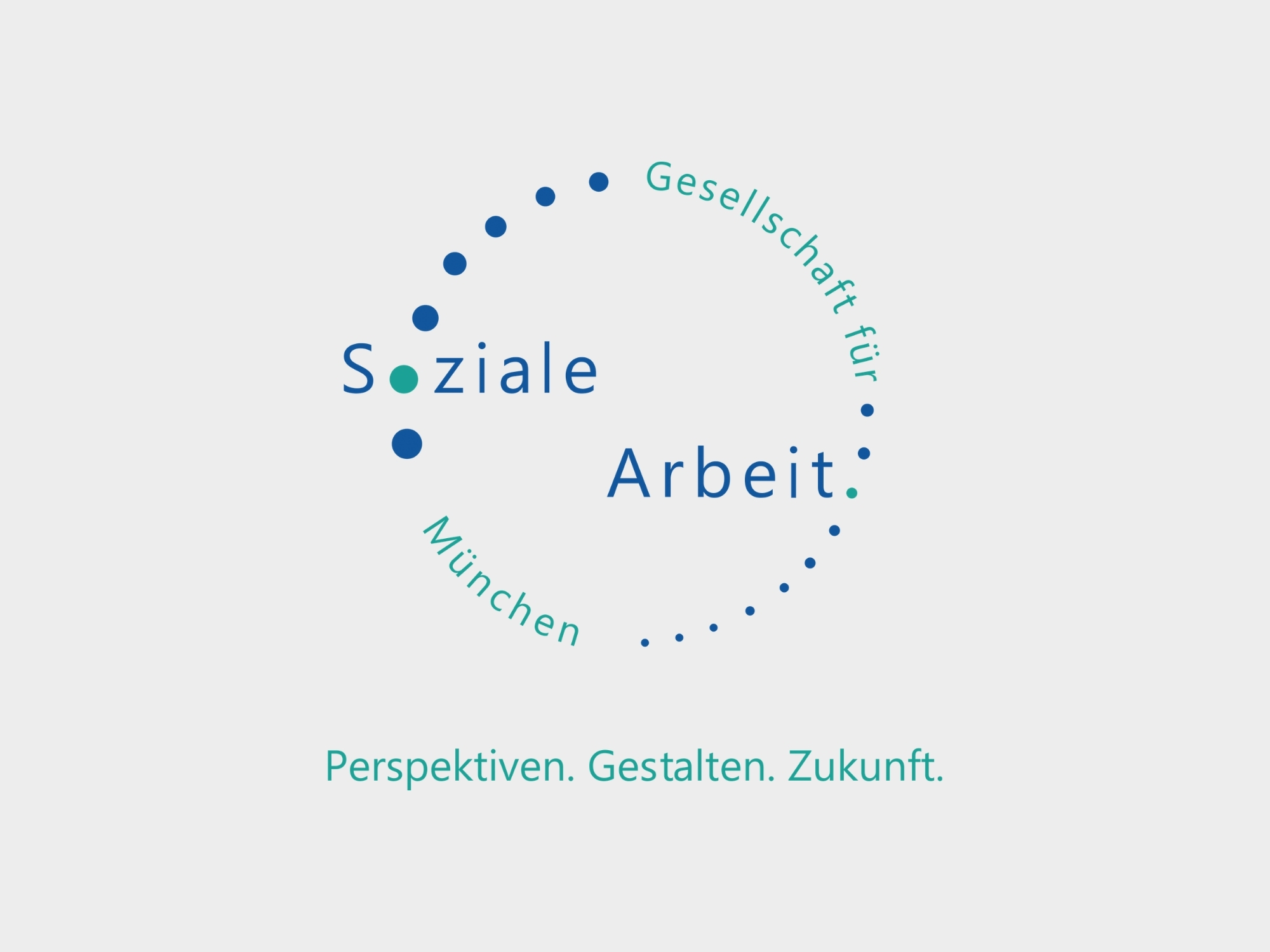
Same dots, same navy, a new identity.
The client responded strongly to this direction from the start – the dot motif breaking beyond the circle, the navy and turquoise combination, the wordmark restructured with “Soziale” set above “Arbeit” to create hierarchy. We refined the balance and spacing, added “München” curving into the arc, and closed it out with the tagline “Perspektiven. Gestalten. Zukunft.” slogan.
Very few rounds of iteration were needed – the direction simply worked for the client.
04. Colour System
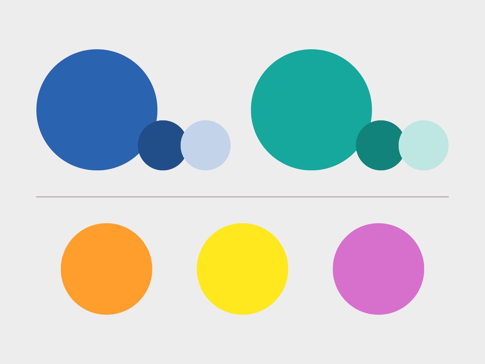
From recognisable to playful.
The navy and turquoise were already at the heart of the new logo, so they naturally became the brand’s primary colours. Together with the client, we added three brighter accent colours to make the identity more flexible, vibrant and fun to use.
The extended palette gave different parts of the organisation their own colour combinations while keeping everything connected to the same visual system – from flyers and publications to events and everyday communication.
05. Deliverables
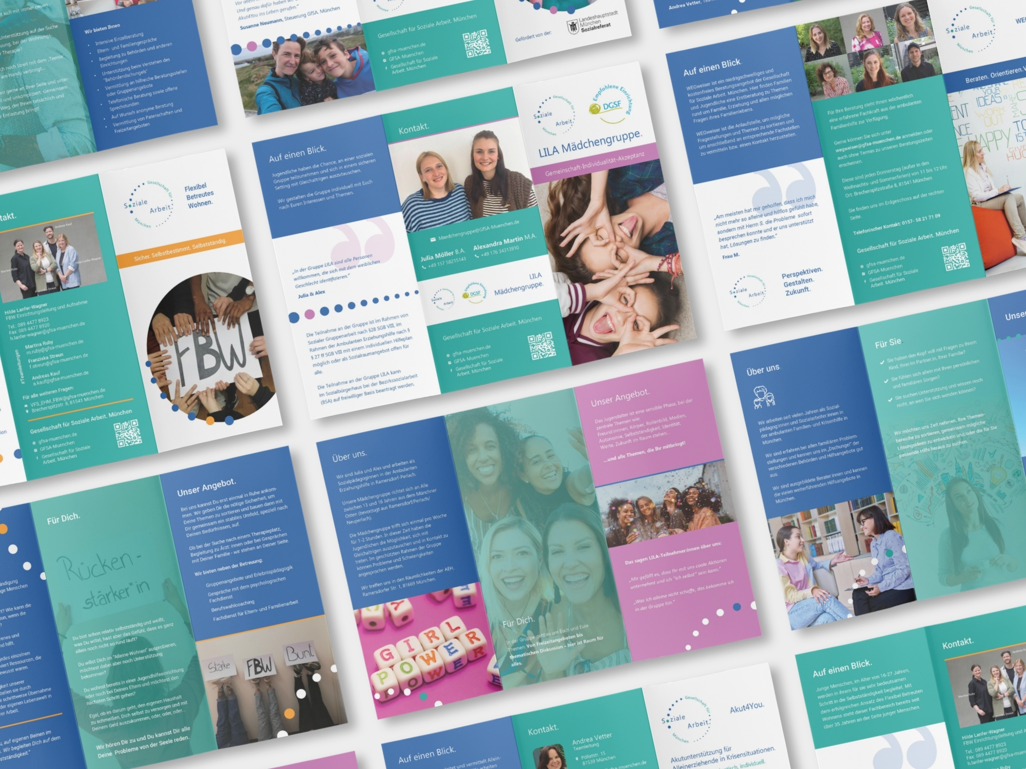
One Brand, Many Expressions.
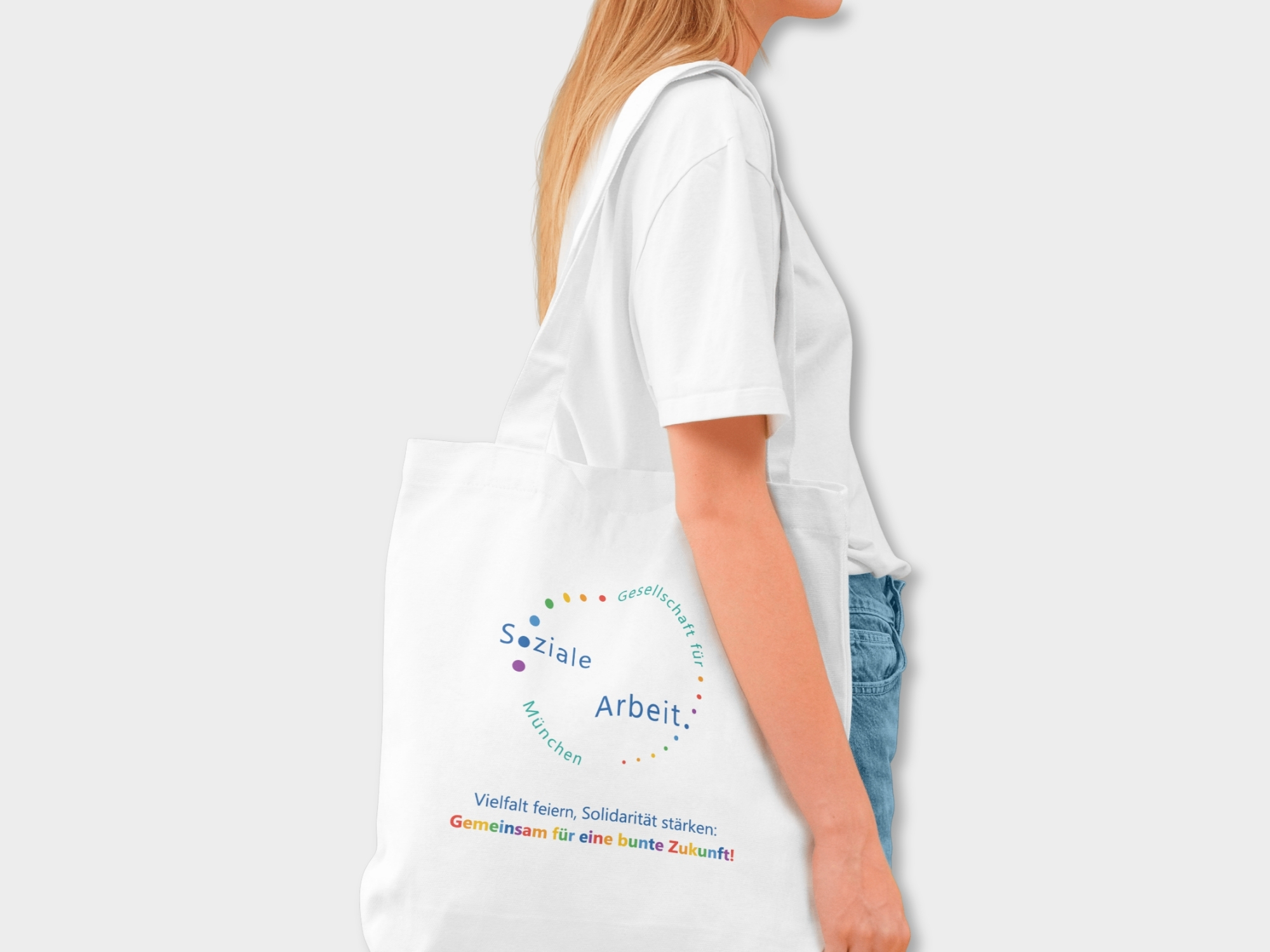
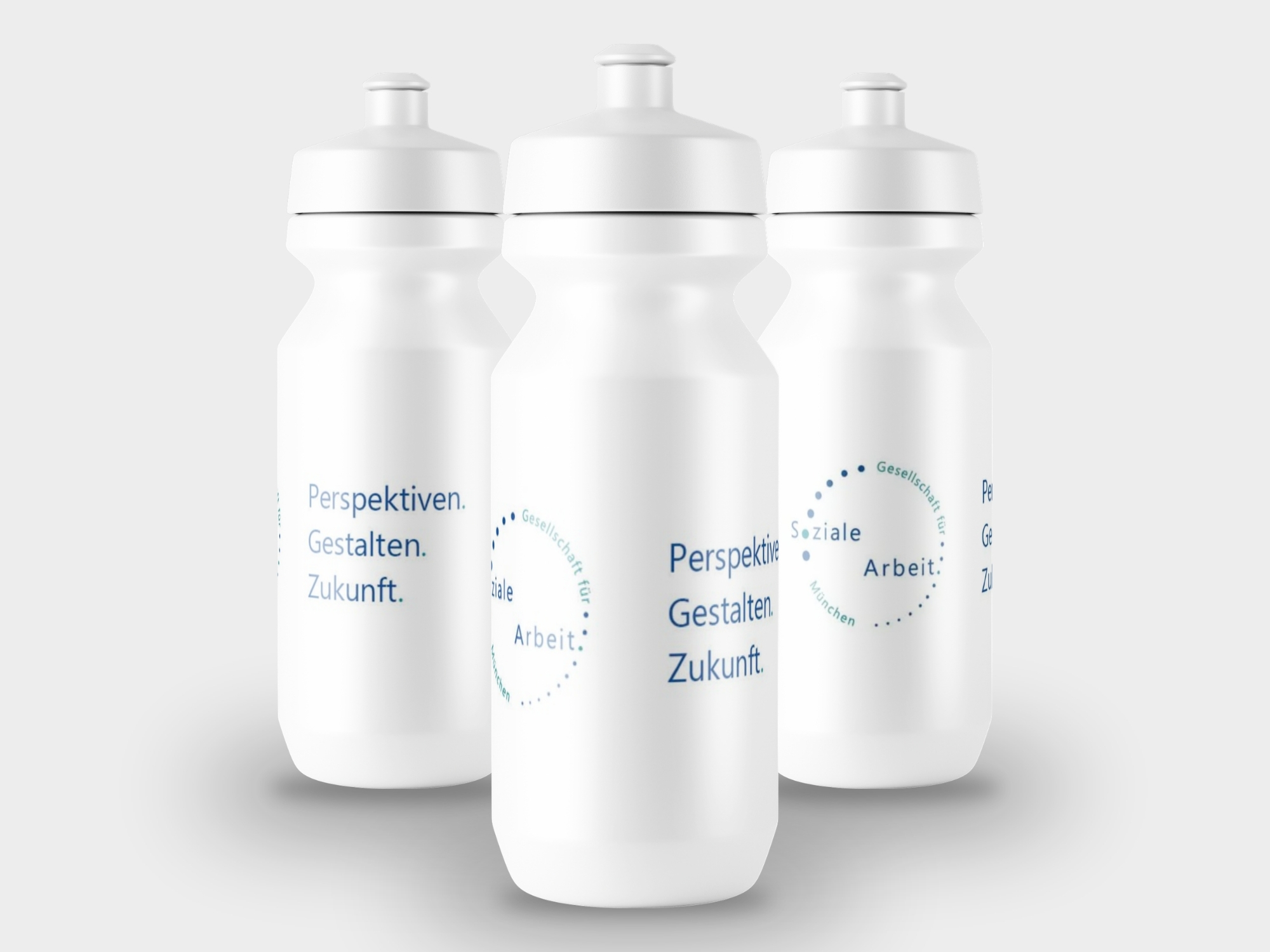
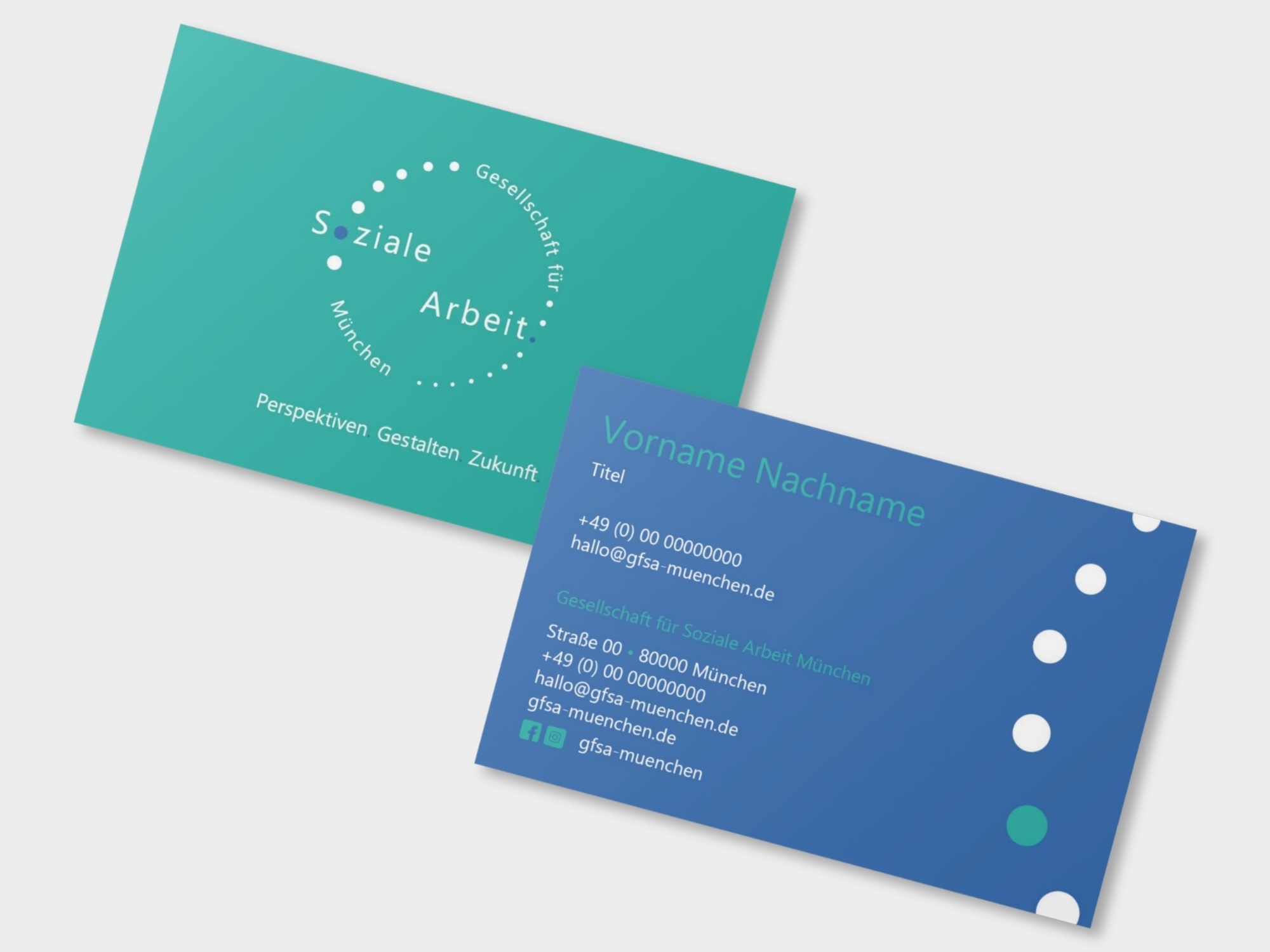
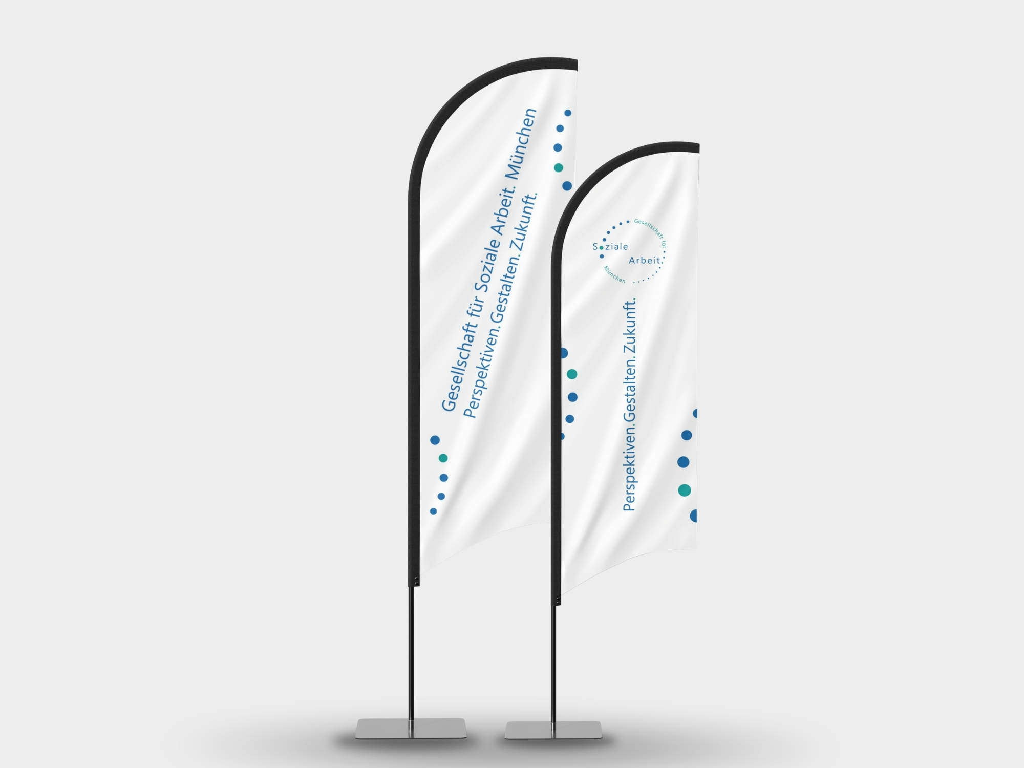
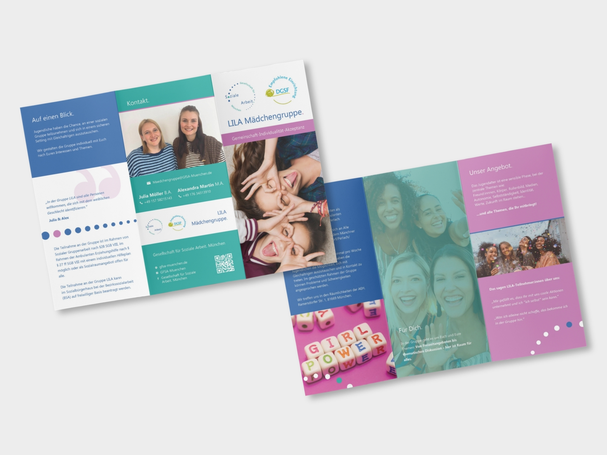
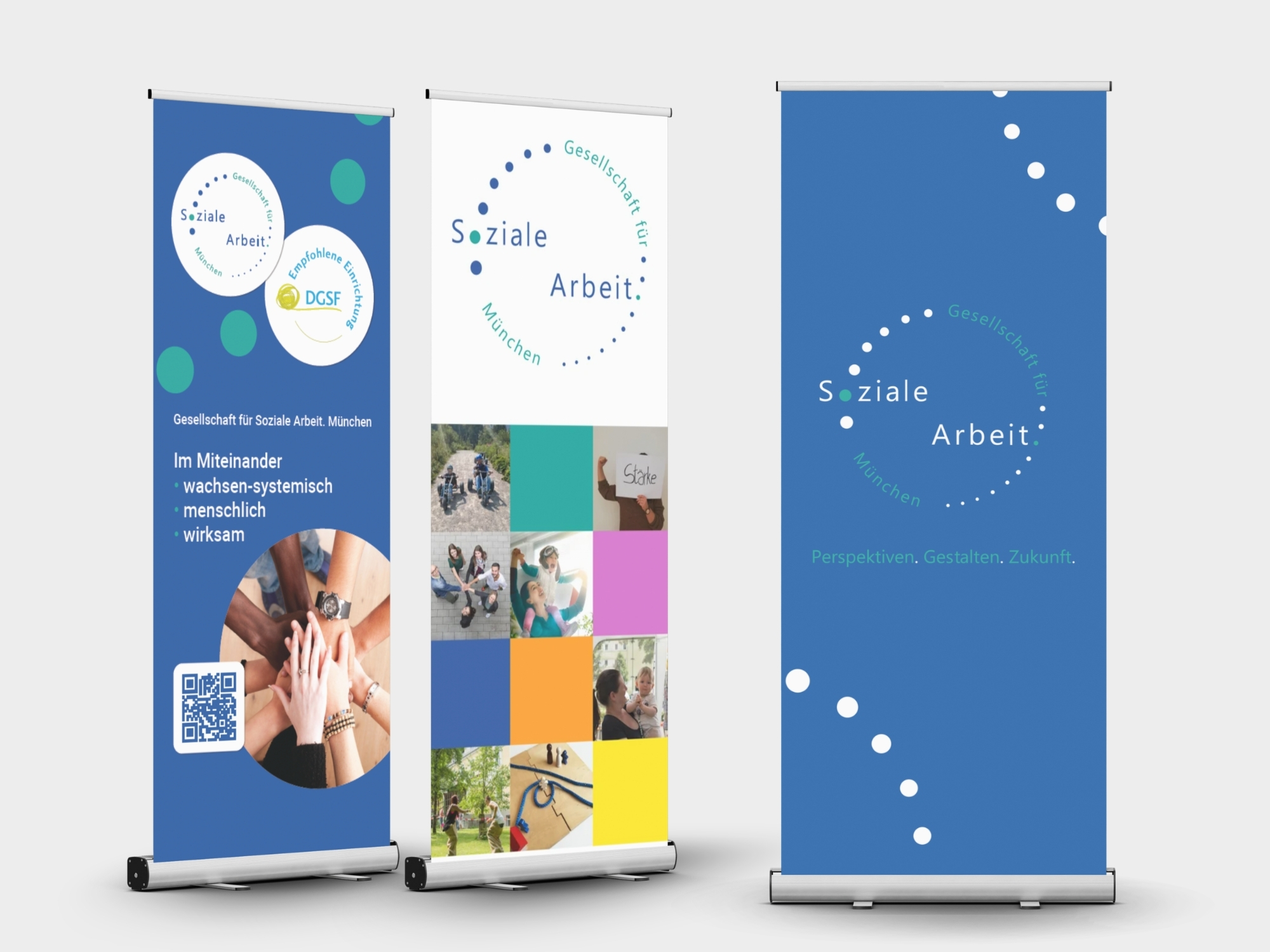
With the identity in place, I translated the system across a wide range of touchpoints – from stationery and business cards to brochures for the organisation’s different services and initiatives. I also designed event materials: roll-ups, flags and branded merchandise, creating a consistent identity that could flex across very different contexts.
From Brand to Digital
The next step was bringing the new identity into a digital system built to serve a large organisation and its growing network.
01. A Website Built to Grow
Making a big organisation feel easy to navigate.
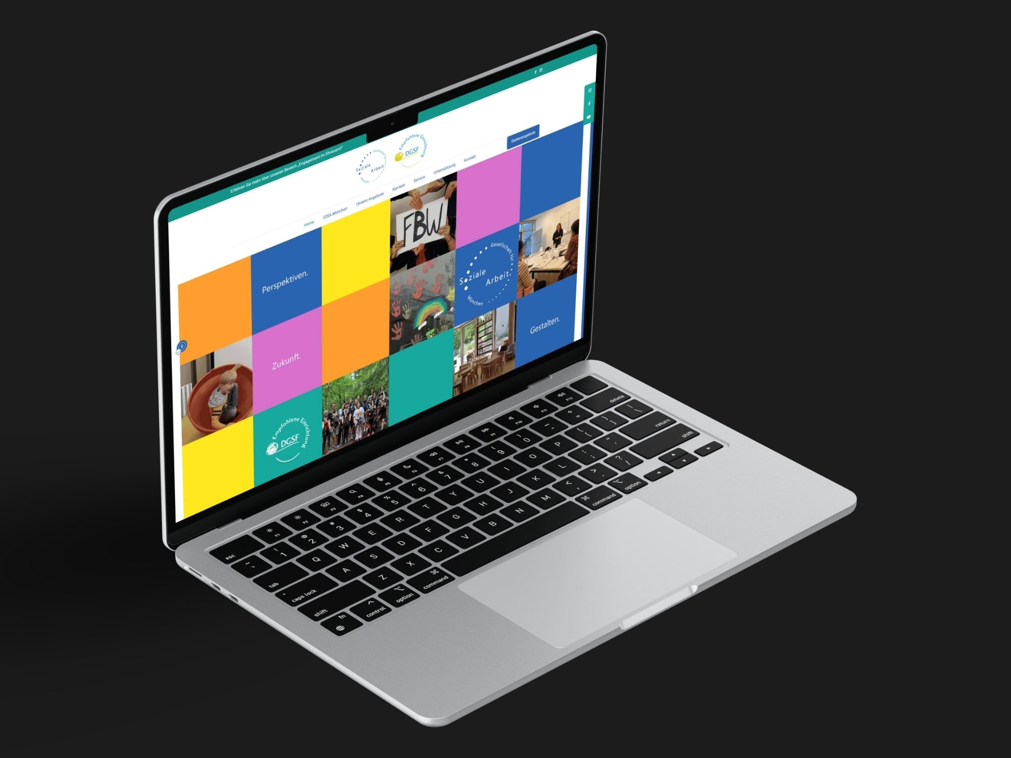
I designed and built the GfSA.München website from scratch, bringing the new identity into a clear digital structure for the organisation and its many services. It needed to hold a lot of information while staying easy to navigate, accessible and simple enough for employees to manage themselves.
I also built in events calendar, news and job postings so the team could keep the website up to date without relying on me for every change.
02. Same framework, different stories
Twenty services. One digital home.
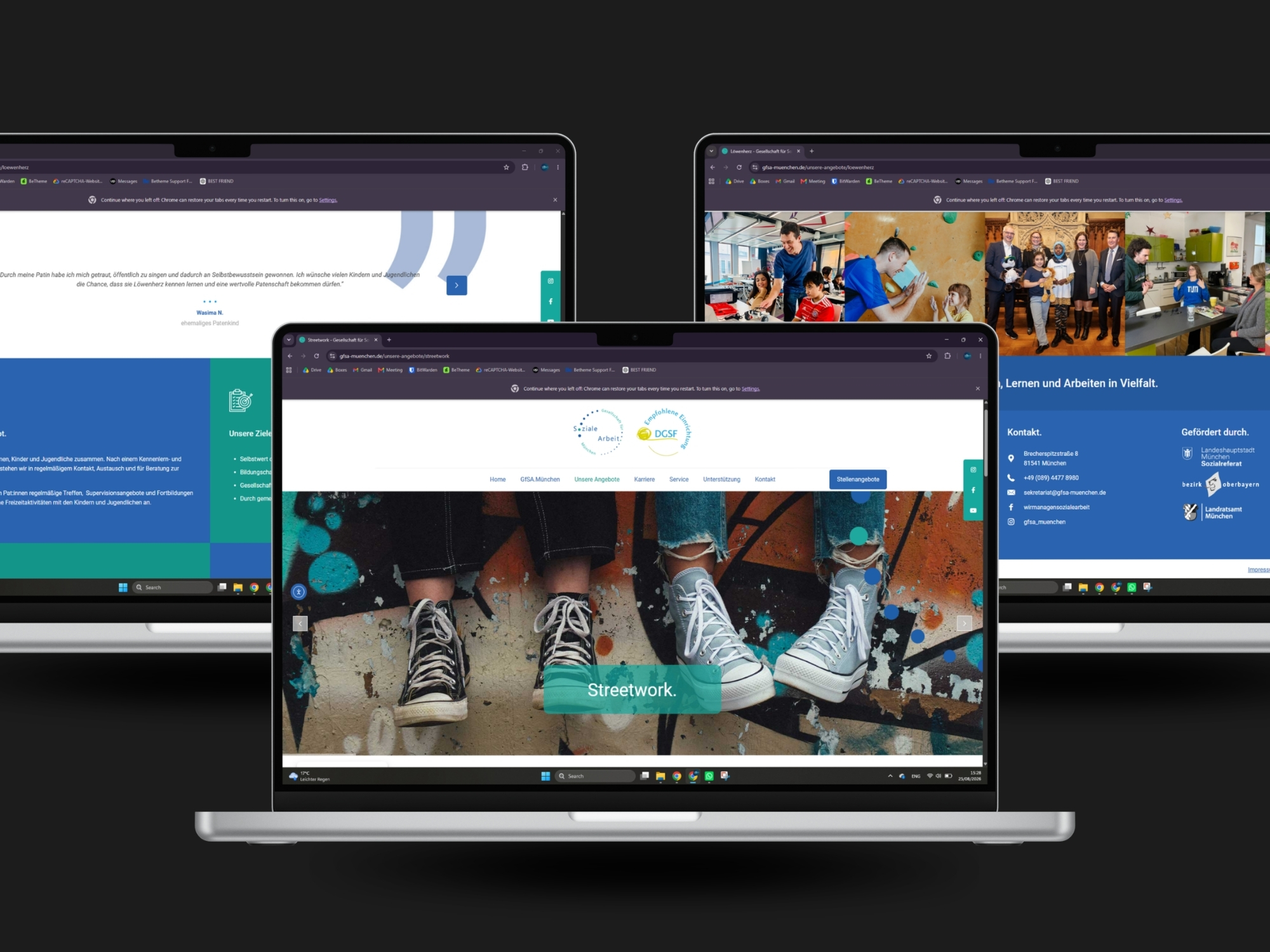
The website brings around 20 different GfSA.München services together under one digital roof. I created a consistent structure for all of them, with the same core sections and navigation throughout, while allowing individual pages to adapt where needed.
The result is a cohesive digital experience that makes a large organisation feel clear, connected and easy to navigate.
03. Mobile first, because access matters
Designed for the people using it.
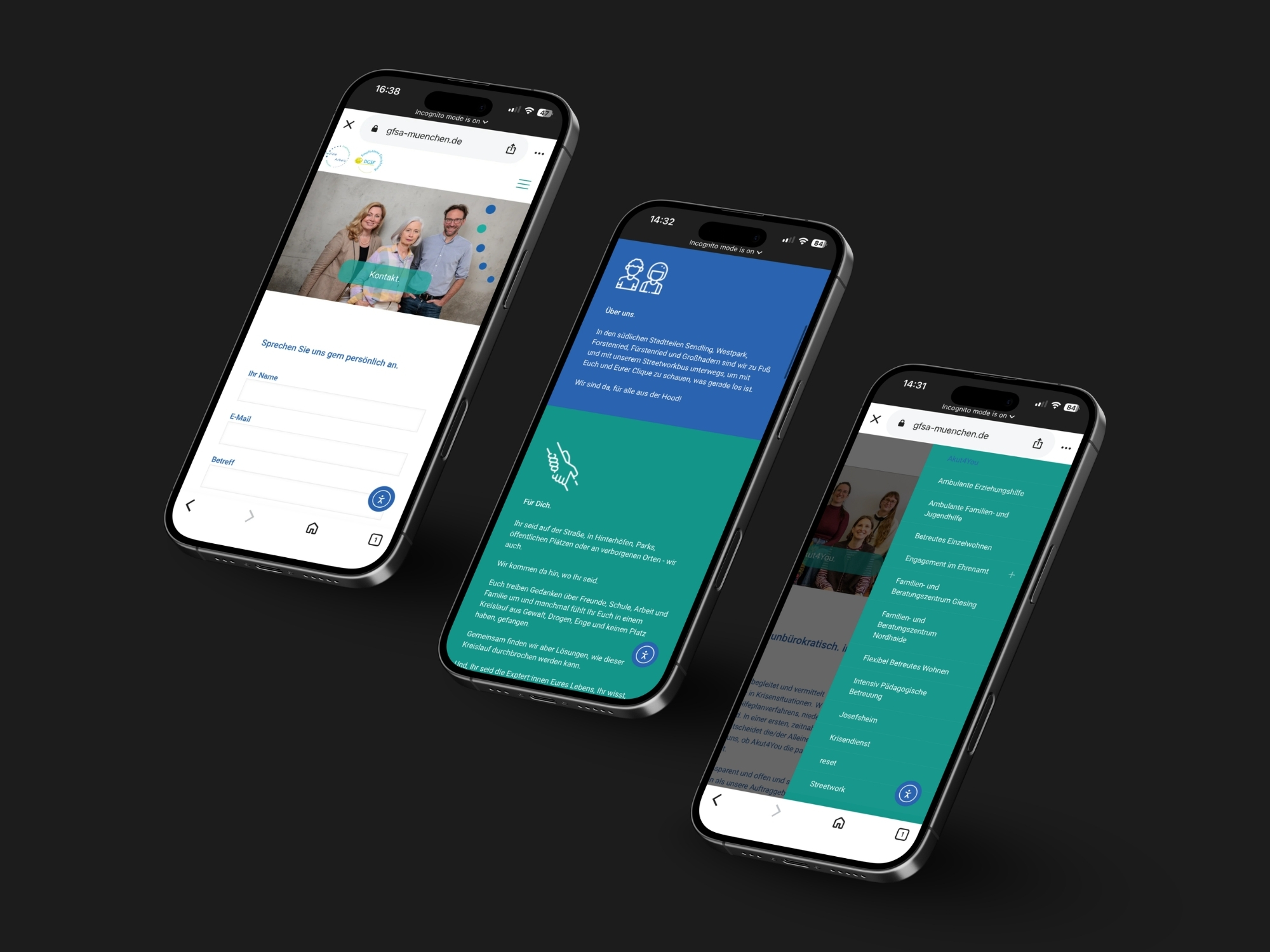
A large part of GfSA.München audience may not have access to a laptop or desktop computer. That made mobile accessibility an important part of the design, not an afterthought. Every service, contact detail, event and piece of information was structured to be easy to find and use from a phone.
04. Accessibility, built into the experience
Making the website easier to access for everyone.
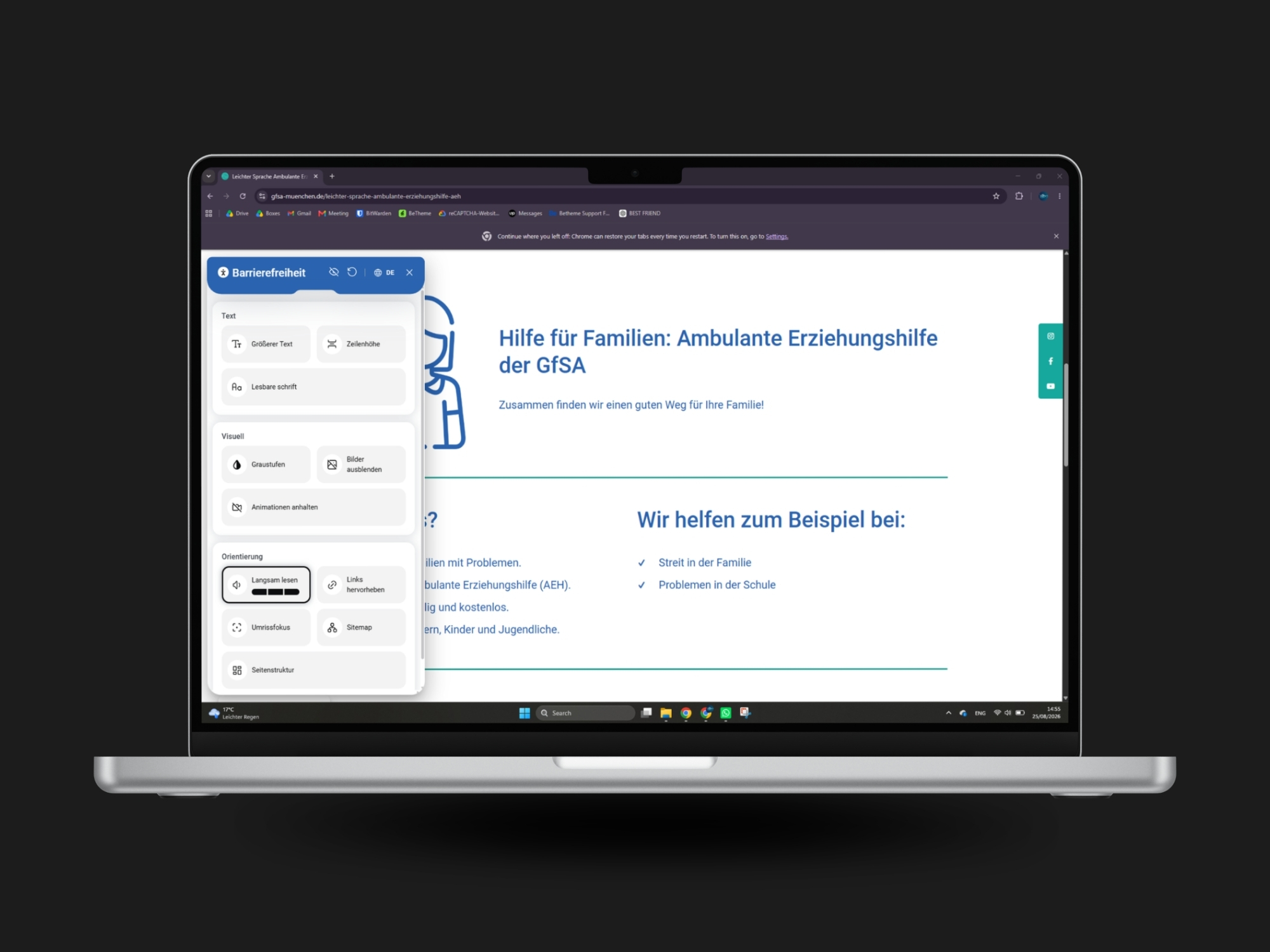
As accessibility requirements in Germany became more relevant in 2025, I researched how other organisations were approaching the change and compared different solutions.
For GfSA.München, budget was an important factor, so I chose an accessibility plugin that could be implemented into the existing website for around €200 per year, rather than requiring a costly rebuild or external service. I then reviewed the site across its many pages, improving colour contrast and implementing tools for keyboard navigation, screen-reader support and other accessibility needs.
05. Accessibility Pages
Making information easier to understand.
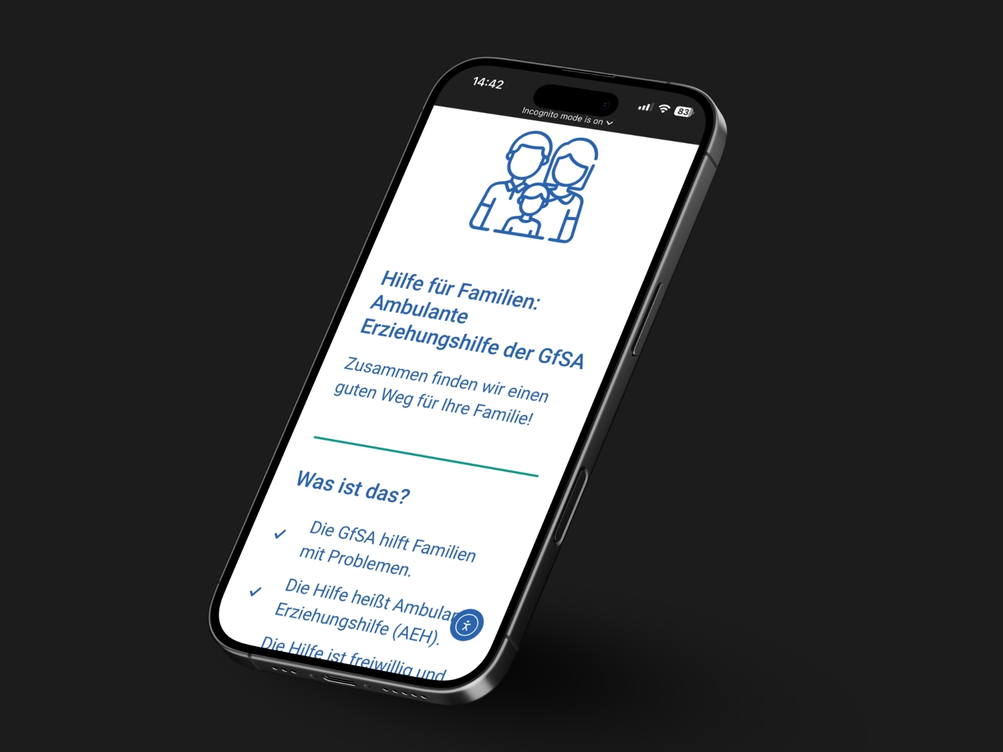
For every one of the 20 GfSA.München services, I created an additional Leichte Sprache (plain-language) page. I stripped the content down to what people really need to know, using simpler language, larger type, more space and a much clearer visual hierarchy. It meant going through the whole website service by service – but the result is a much more approachable version of the information for people with different reading and language needs.
06. A website that works for people
The best feedback came from the people using it.
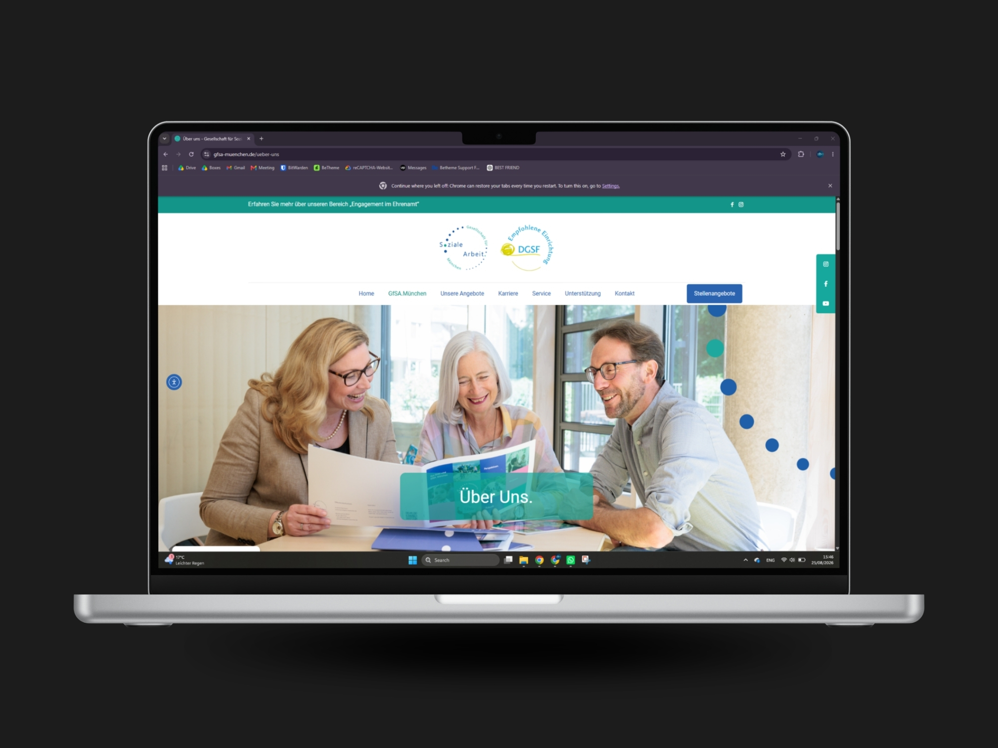
The GfSA.München website has grown into a large digital platform with dozens of pages, 20 service areas, a blog, event calendar and integrated donation system. But the feedback I value most isn’t about how much is on the website – it’s that people can actually find what they need.
Users regularly tell the GfSA team that the information is easy to navigate, contacts are easy to find and the overall experience feels friendly and approachable – and that’s exactly what the website was meant to do.
Workshop
Building a website GfSA could run themselves.
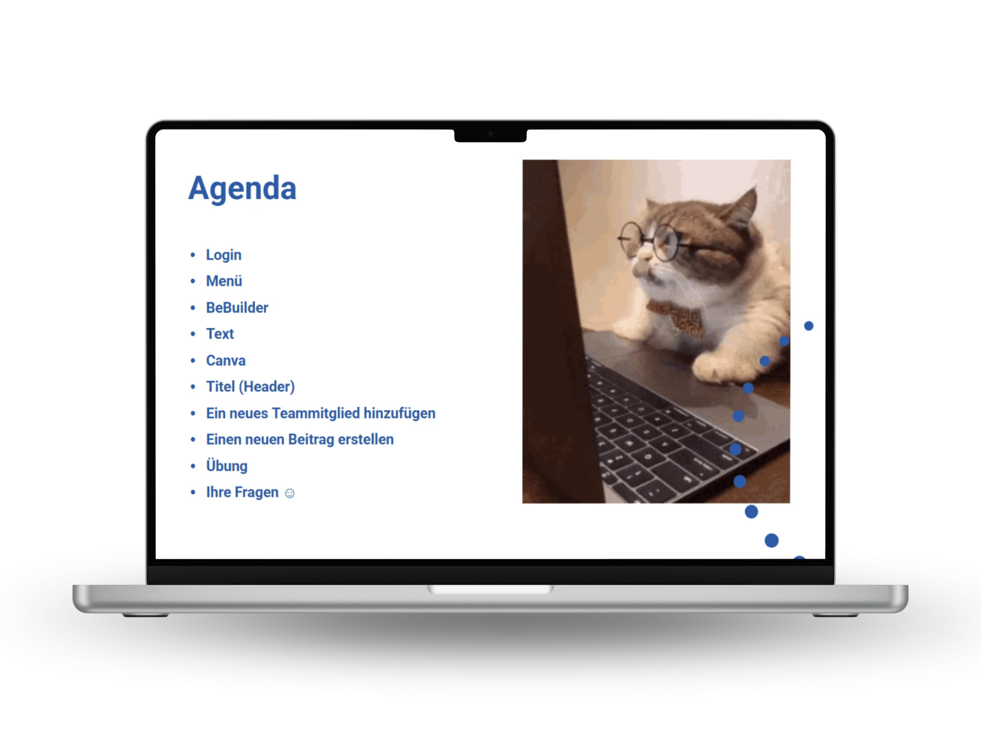
The website needed to be easy enough for the GfSA team to manage day to day - from publishing job listings and blog posts to updating photos, team members and events. I created and ran a hands-on WordPress workshop in German, supported by around 10 step-by-step tutorial videos, so the team could make these updates without relying on me for every small change.
The result: the team can manage the website independently, while I continue to support them with larger updates and ongoing design work.
Additional brands
Alongside the main GfSA identity, I also created several standalone brands for initiatives within the organisation. Each had its own audience, purpose and visual personality, while still remaining connected to the wider GfSA brand.
These are three examples that grew out of our ongoing collaboration.
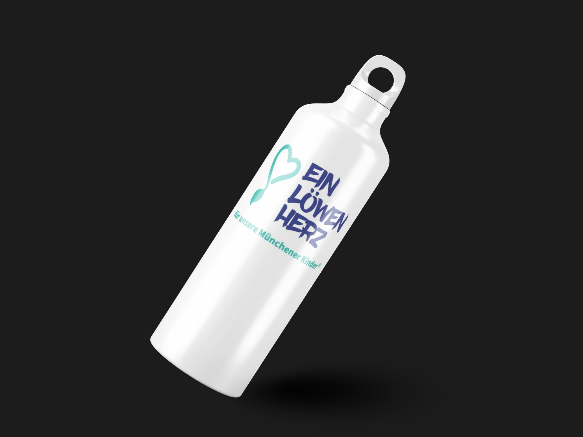
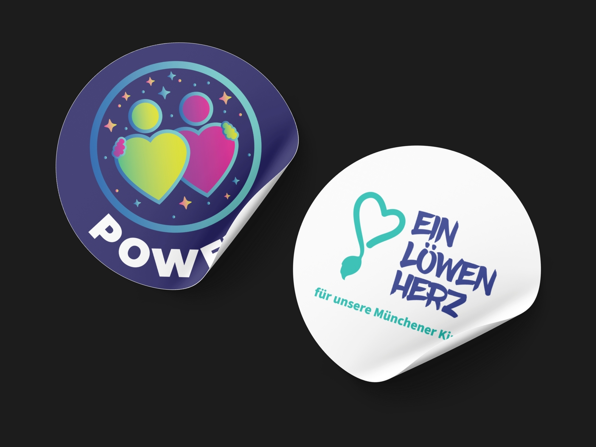
Ein Löwenherz für unsere Münchener Kinder.®
Connecting children and young people with volunteer mentors who support and accompany them through everyday life.
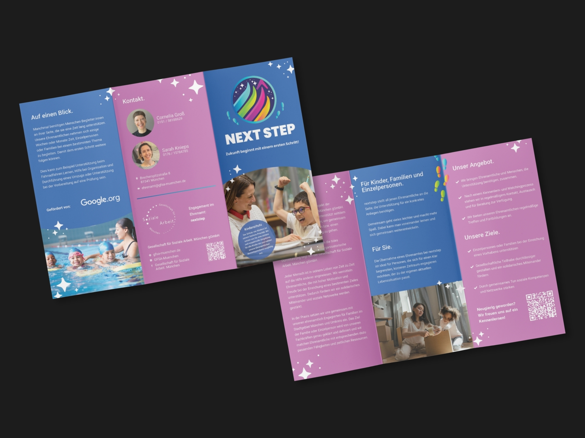
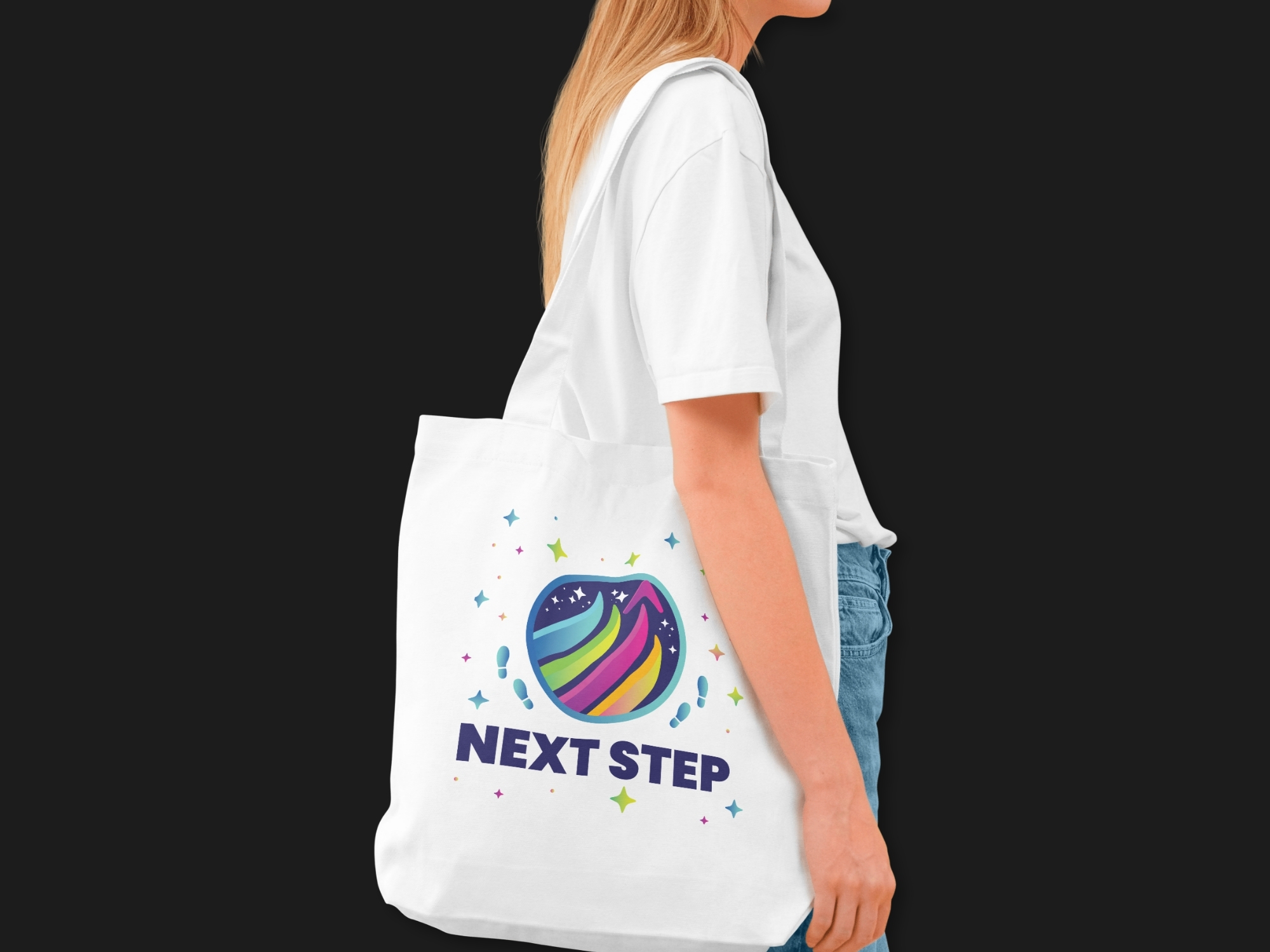
NEXTSTEP
Providing practical, temporary support to individuals and families so they can take their next step forward.
POWER2
Supporting children through volunteer mentors who help them discover and develop their strengths and potential.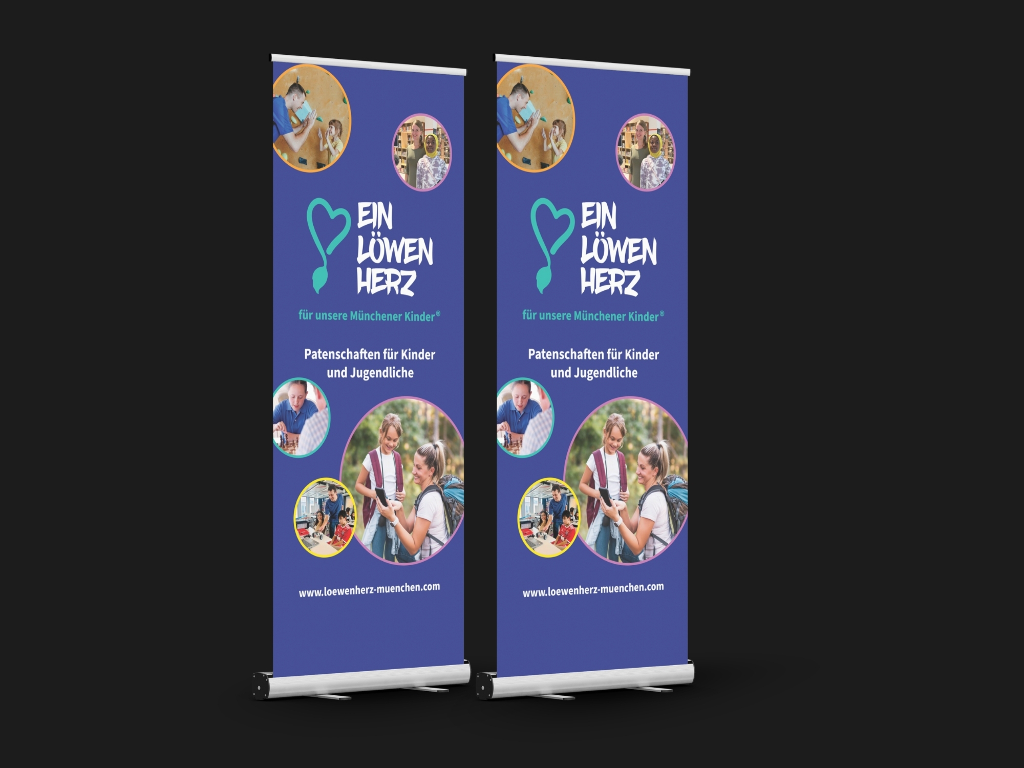
Client Feedback
Die Zusammenarbeit mit Ernesta bei der Entwicklung unseres kompletten Web- und Print-Auftritts war für uns ausgesprochen gewinnbringend, professionell und inspirierend. Besonders beeindruckt hat mich ihre kreative, zeitgemäße Gestaltung, ihr außergewöhnliches Gespür für Details sowie ihre Fähigkeit, unsere Vorstellungen schnell zu erfassen und in überzeugende Lösungen zu übersetzen. Sie hat uns zudem souverän in moderne Programme und Arbeitsweisen eingeführt, sodass wir viele Prozesse gemeinsam effizient und unkompliziert umsetzen konnten. Die Zusammenarbeit war geprägt von hoher Verbindlichkeit, gegenseitigem Vertrauen und einer bemerkenswert schnellen Umsetzung – ich würde jederzeit wieder sehr gerne mit ihr zusammenarbeiten.
Susanne Neumann
Managing Director, Gesellschaft für Soziale Arbeit. München
In a Nutshell
- Brand identity
- Brand system
- Sub-brand logos
- Website
- Accessibility
- Events calendar
- Print materials
- Campaigns
- Deliverables for events
- Merchandise
- WordPress/Canva Training
- Ongoing collaboration

Outcome
I built a flexible visual and digital system that brought GfSA.München growing network together under one recognisable brand. From the website and accessibility to print, events and individual sub-brands, the system was designed to work across a wide range of people, needs and formats.
The result is a brand that continues to grow, adapt and be managed by the organisation itself - with us still working together today.