


Skratchwork.
A glittery visual identity for an indie rock band.
Scratchwork is an indie rock band with a personality that doesn’t fit neatly inside the lines. They wanted their visual identity to feel just as expressive as their music - glittery, imperfect, fun and a little unconventional.
I created a custom logo, illustrated portraits of the band members and a flexible visual language that brought their personality to life across digital and music releases.
- Role:
I created the visual identity, custom logo and illustrated portraits, translating the band’s personality into a playful digital language.
- Deliverables:
Logo Design • Illustration • Digital Art • Cover Artwork
- Timeline:
2020 – 2021
Designing Process
The following slides explore the evolution of Scratchwork’s visual identity - from a structured original logo to a more expressive, personal and imperfect visual language inspired by the band itself.
01. A New Visual Direction
From structured to spontaneous.
Scratchwork wanted a visual identity that felt more like the band itself – unconventional, energetic and a little imperfect. We moved away from their structured original logo and explored a looser, more expressive direction built around hand-drawn elements, colour and a touch of glitter.
02. From Old to Unfiltered
Breaking away from the original.
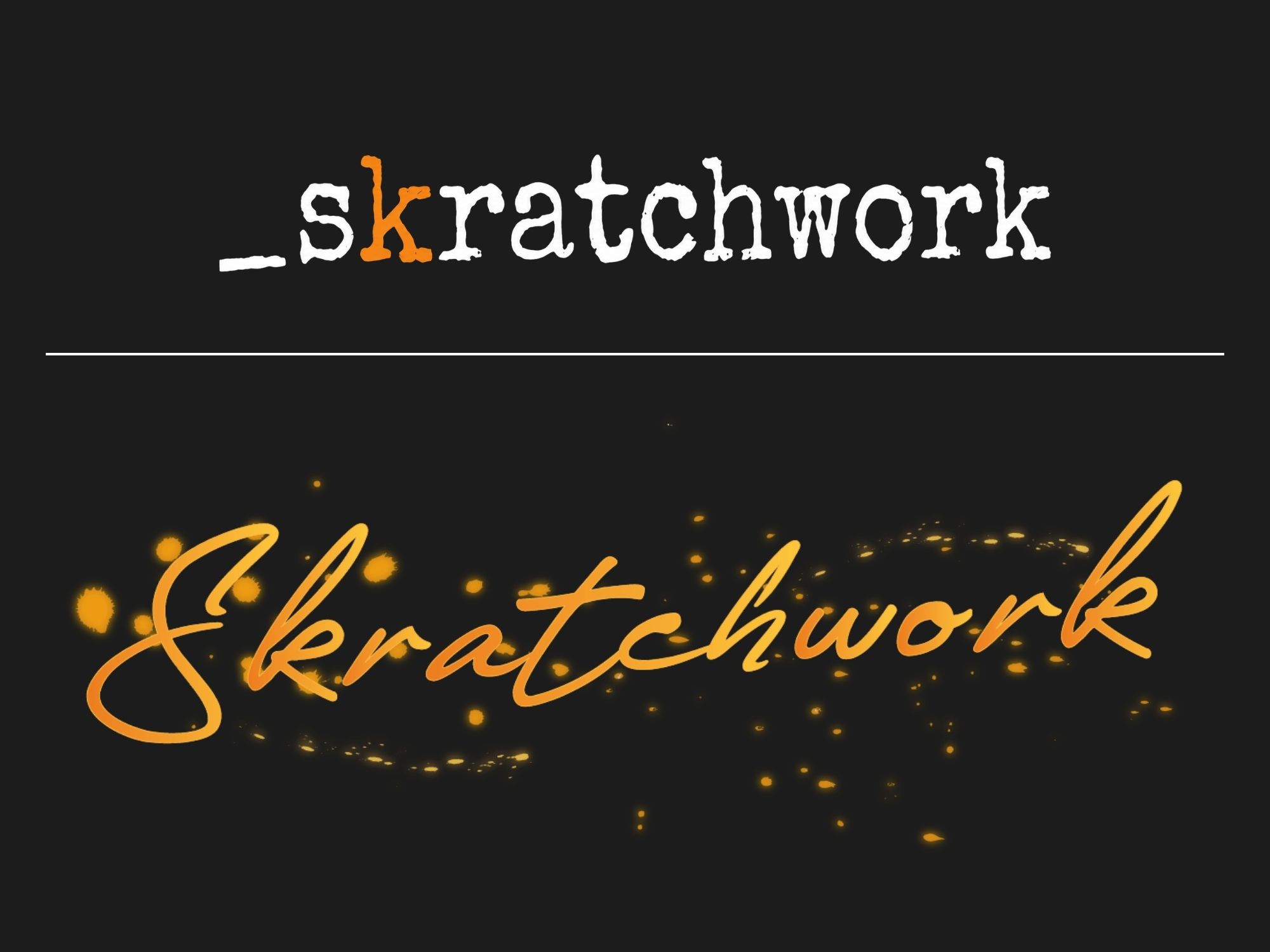
The original logo felt clean and structured, but it didn’t capture the personality of the band. I developed a new handwritten wordmark that embraced movement, imperfection and a more playful character – giving Scratchwork a visual identity that felt distinctly their own.
03. From Photograph to Illustration
Turning the band into characters.
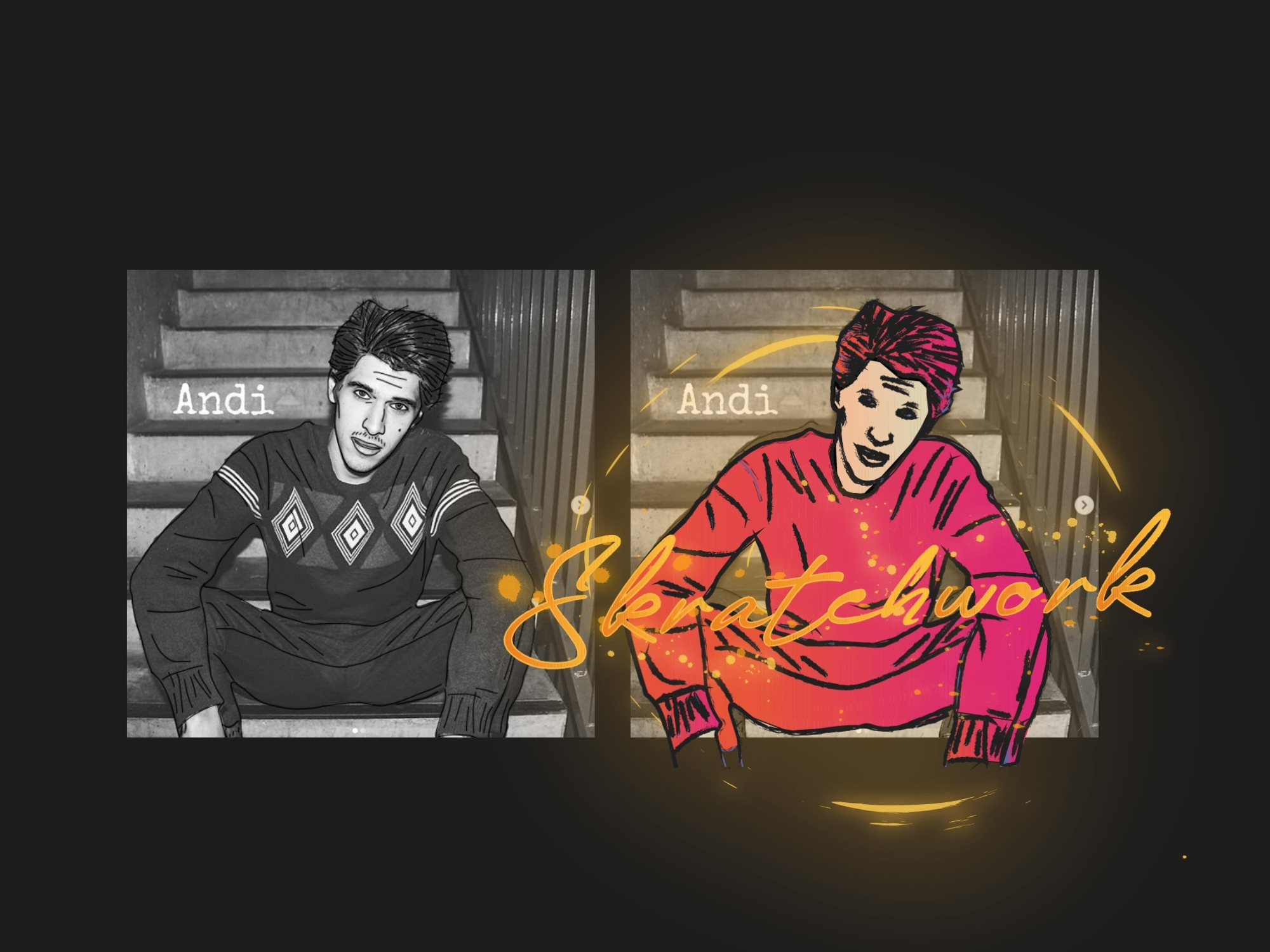
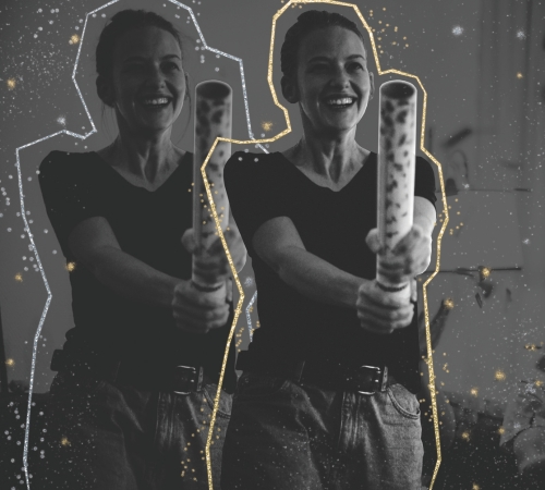
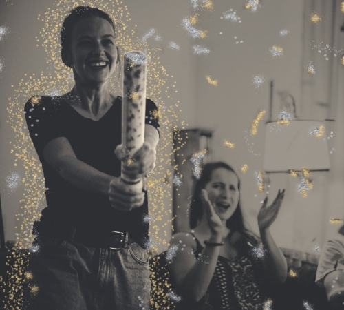
The team photographs became the starting point for a series of illustrations. I began by loosely tracing and outlining each member, gradually turning the rough sketches into imperfect, expressive portraits. The result felt personal and authentic – and strongly resonated with the band.
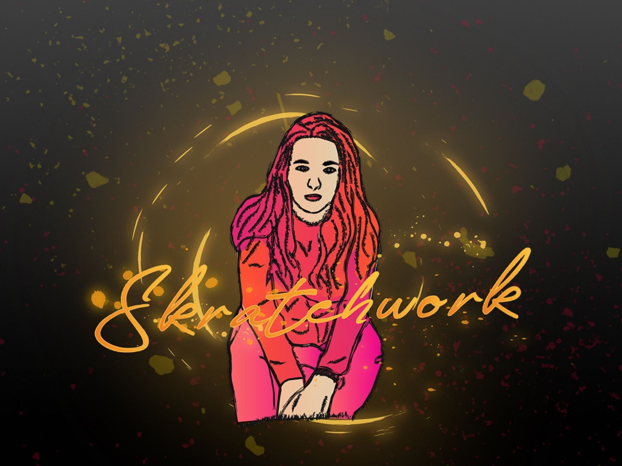
04. Four members. One visual language
The Whole Band.
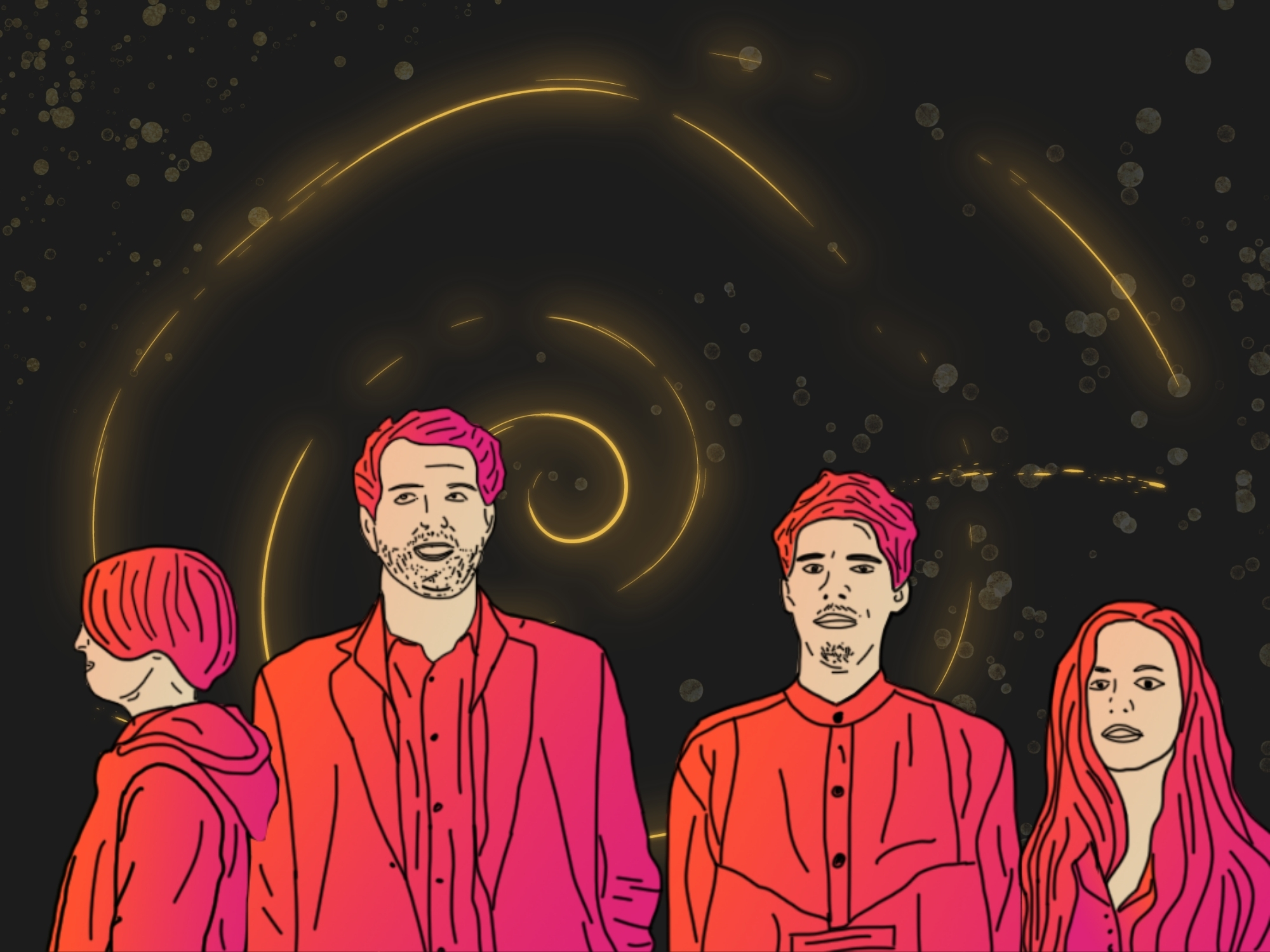
Each band member received their own illustrated character, while keeping the same loose drawing style, colour palette and visual treatment. Together, the portraits created a flexible visual system that could be used across the band’s website, music and future releases.
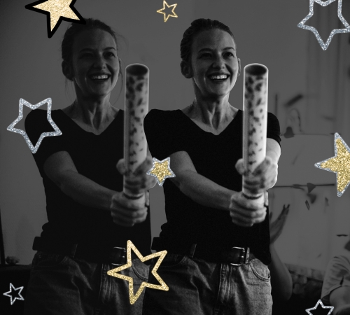
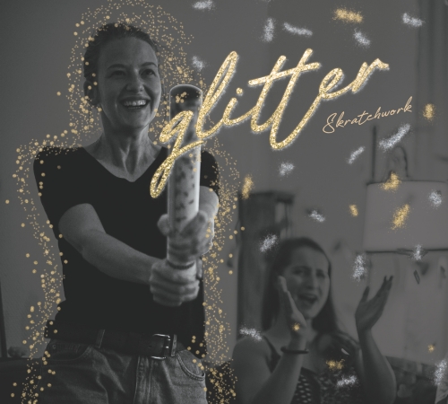
Single cover
Client Feedback
“We loved Ernesta’s work so much, we wrote a song about her.”
“She’s a boogie unicorn,
a Scottish deep sea dinosaur.
She’s gonna make you move to Latin grooves.
She is the next big thing,
Nessie is the next big thing.
Six-foot celebrity elect in black.
A Dorothy-like golden charm,
twinkle little star,
Adobe Illustrator Top-Creator.
Nessie is love, Nessie is life.”
- Skratchwork

Outcome
I had the opportunity to create a visual identity that felt as unconventional and energetic as the band itself. The new logo, illustrated portraits and glitter-driven visual language gave Scratchwork a distinctive personality that could extend across their music releases and the fact that they came back for their next release made it even more rewarding.