


TwentyNine.
Growing a Brand While the Business Evolved.
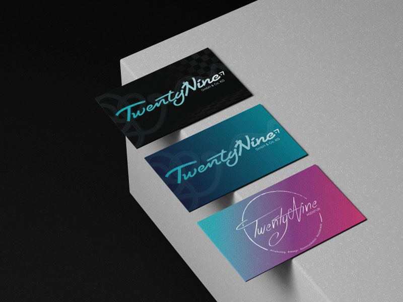
Over several years, TwentyNine evolved from a small event business into a creative agency with a distinct identity and digital presence. Rather than redesigning everything from scratch, each iteration responded to new business goals, audiences and market changes while preserving the strongest parts of the brand.
- Role:
Led the evolution of the TwentyNine brand, shaping its strategy, identity and digital experience from concept to implementation across multiple redesigns.
- Deliverables:
2 Major Rebrands • 4 Website Iterations • Brand System • Social Media • Print Design
- Timeline:
2021 – 2026
The Impact.
I led two rebrands that evolved TwentyNine’s identity alongside its growing team, changing audience and expanding role.
Over the years, the brand evolved alongside the business.
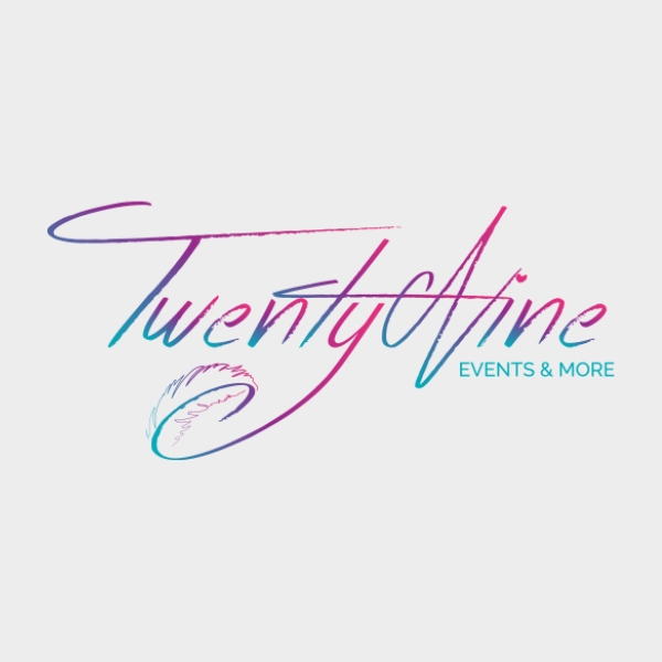
2019-2021
Events Managemenet
A personal event company built around community, creativity and its founder's personality.
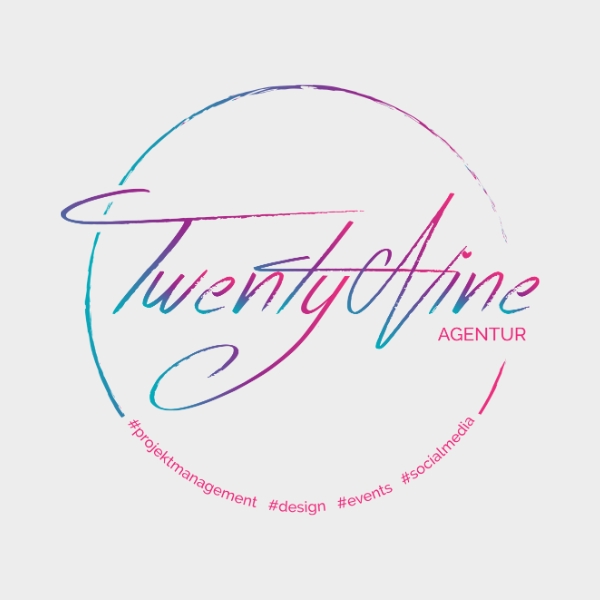
2021
Agency Foundation
The business shifted from events to creative digital agency, requiring a clearer positioning and a more professional digital presence.

2023
Growing Together
As the team expanded, the brand became bolder and more confident. The focus shifted from how it looked to what it represented, evolving into a cohesive identity system built around strategy, creativity and process.
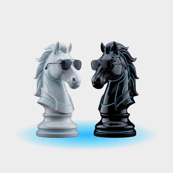
2026
Digital AI-Evolution
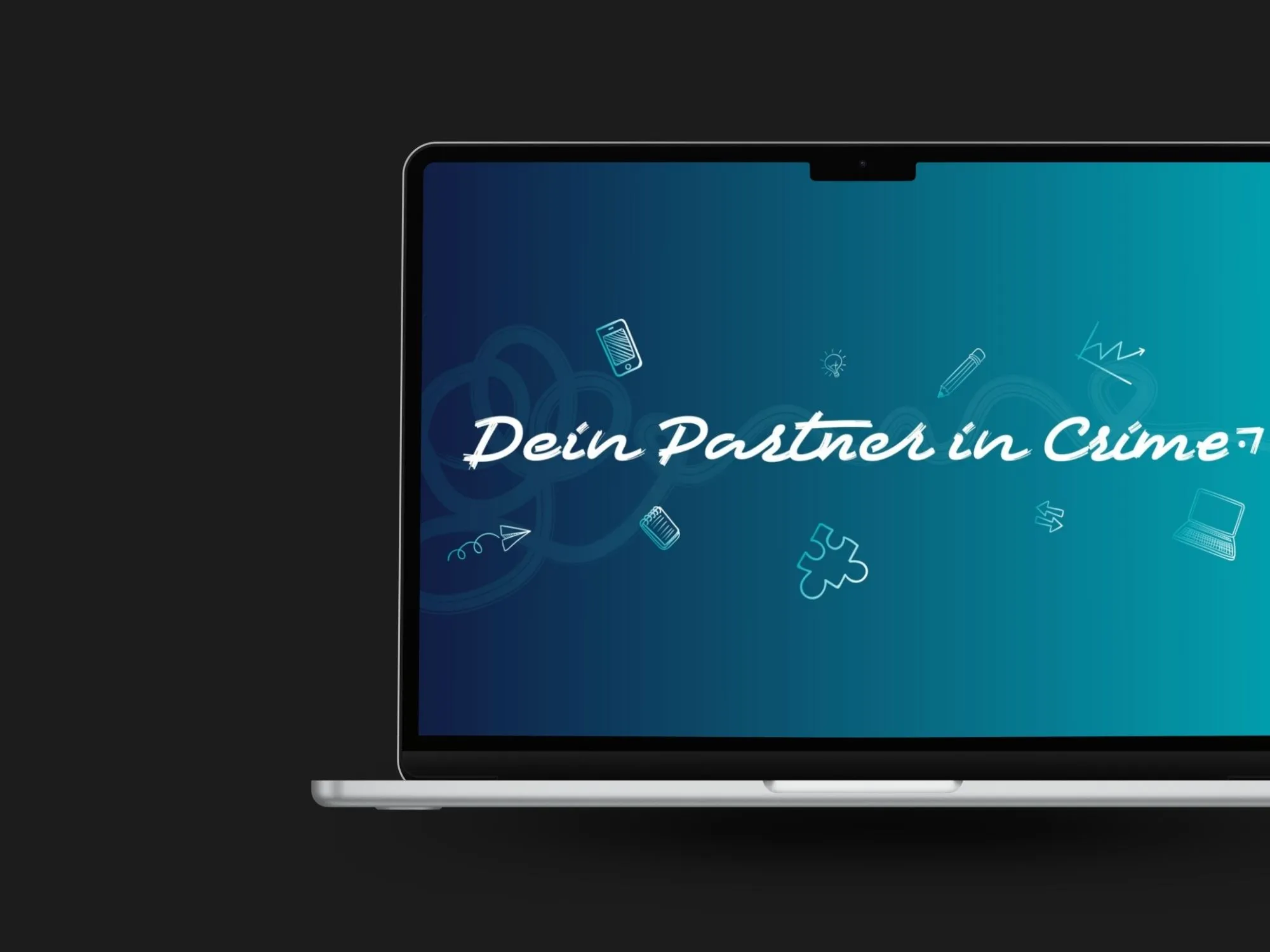
As the industry is evolving fast, so is the brand. The new bolder visual identity transformed the agency's "Partners in Crime" philosophy into a strategic and memorable digital experience.
Brand Evolution
Great brands are built over time. This journey showcases how TwentyNine evolved through experimentation, strategic decisions and continuous refinement into a cohesive identity system.
01. TwentyNine Brand
From Creative Studio to Strategic Agency
TwentyNine evolved alongside the agency itself! As our services, team and ambitions expanded, the brand needed to mature, too. This case study documents the complete journey – from an early identity to a strategy-driven visual system.
02. Agency Foundation
The First Identity
The original brand reflected the founder’s personal style and established TwentyNine’s first visual presence. It successfully represented the agency during its early years while building recognition and gaining its first clients.
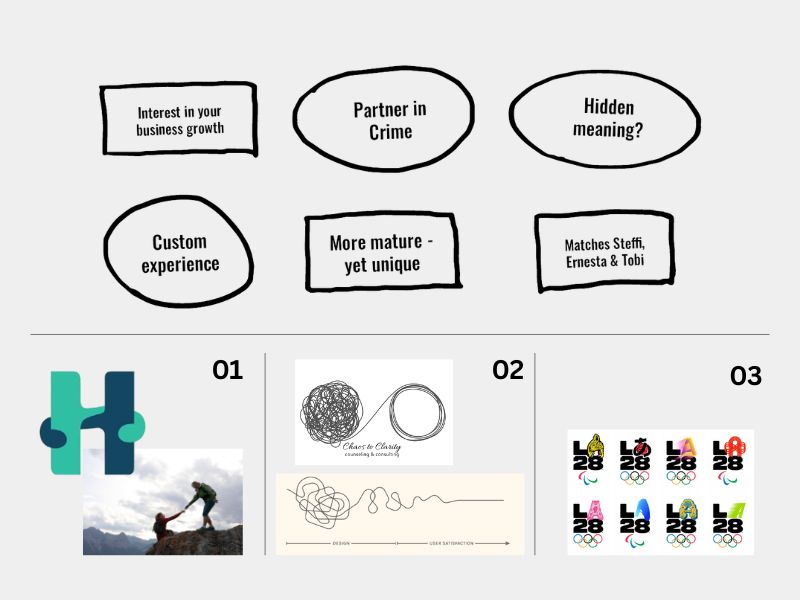
03. Concept Exploration
Defining a New Direction
As the agency evolved, the existing identity no longer reflected the team or our ambitions. Through collaborative workshops, we explored values, positioning and visual directions to define what the next generation of the brand should become.
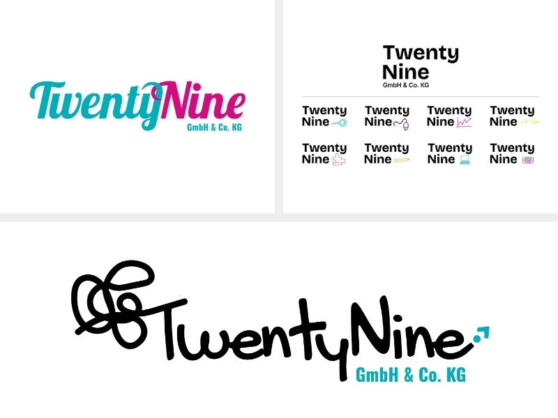
04. Finding Identity
From Ideas to Identity
With the strategic direction defined, the next step was to visualize it. I developed three initial identity concepts that explored different visual approaches, allowing the team to evaluate what best reflected TwentyNine’s evolving character and ambitions.
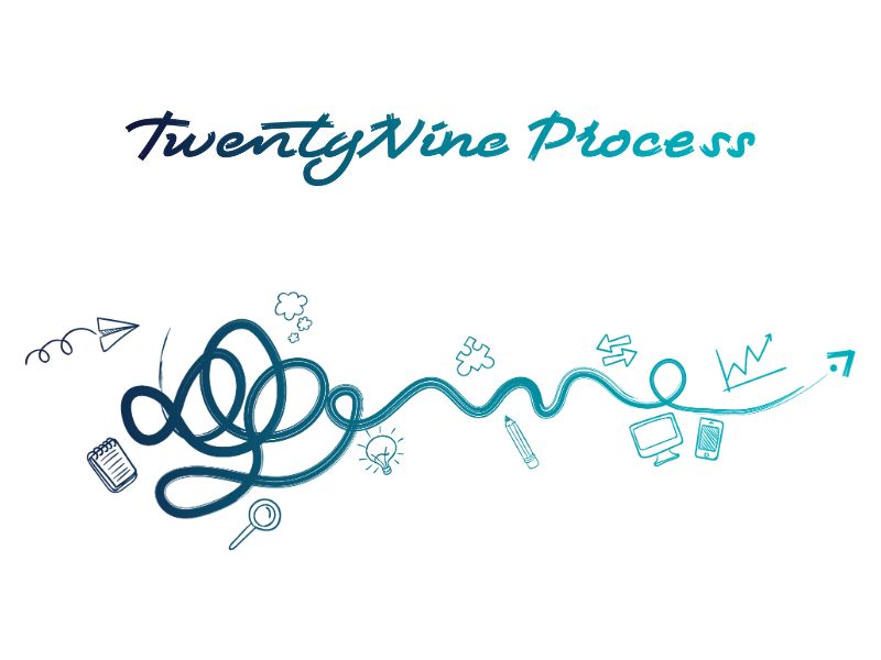
05. Refining the Brand
Building a Cohesive System
With the creative direction established, every element was refined into a consistent brand system. The visual identity, messaging and supporting graphics were developed together to create a recognizable and flexible design language.
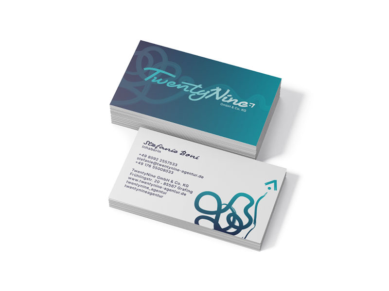
06. Brand Rollout
A Complete Brand Experience
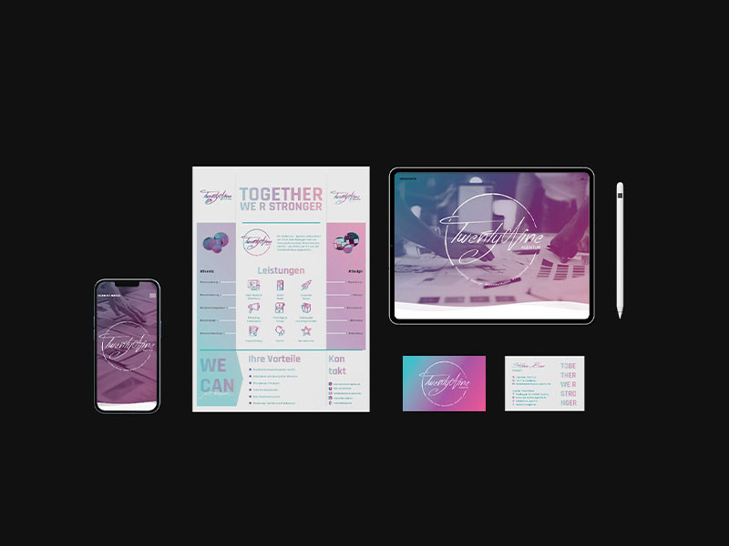
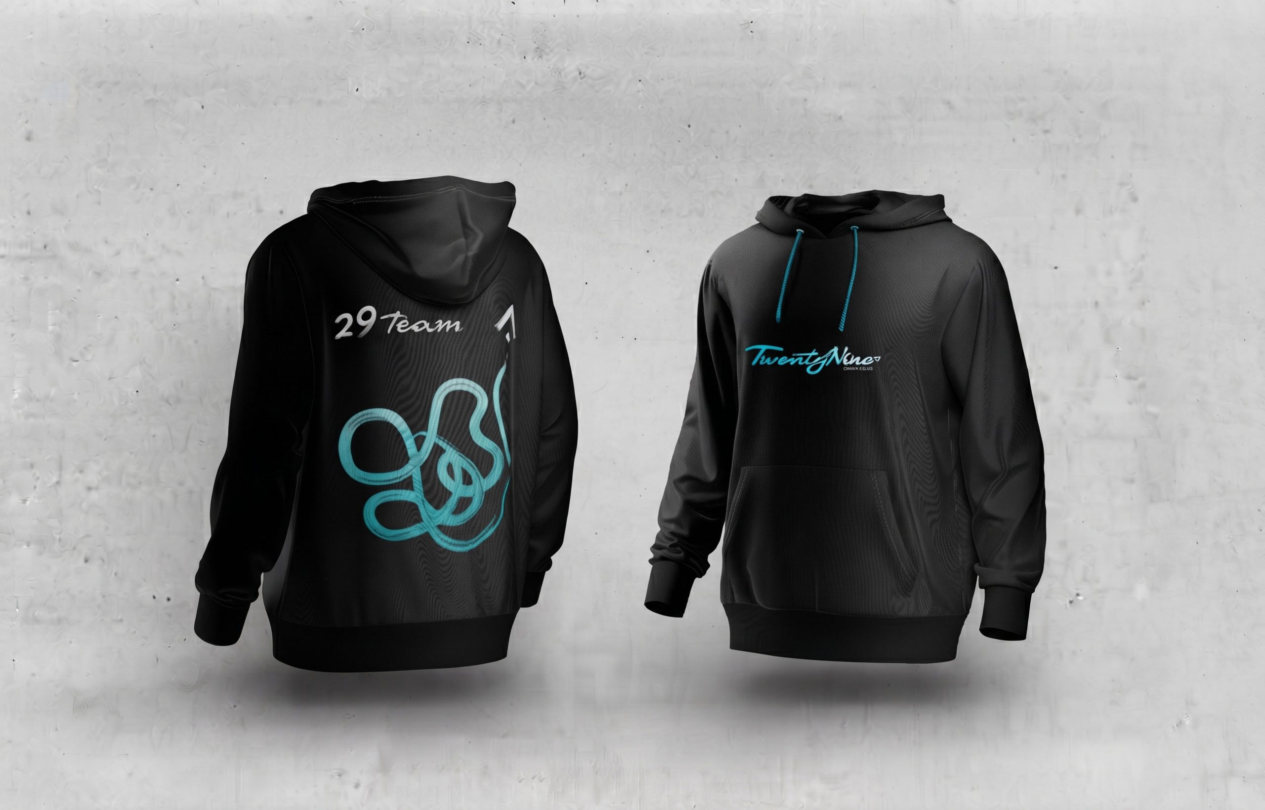
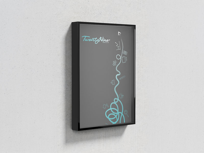
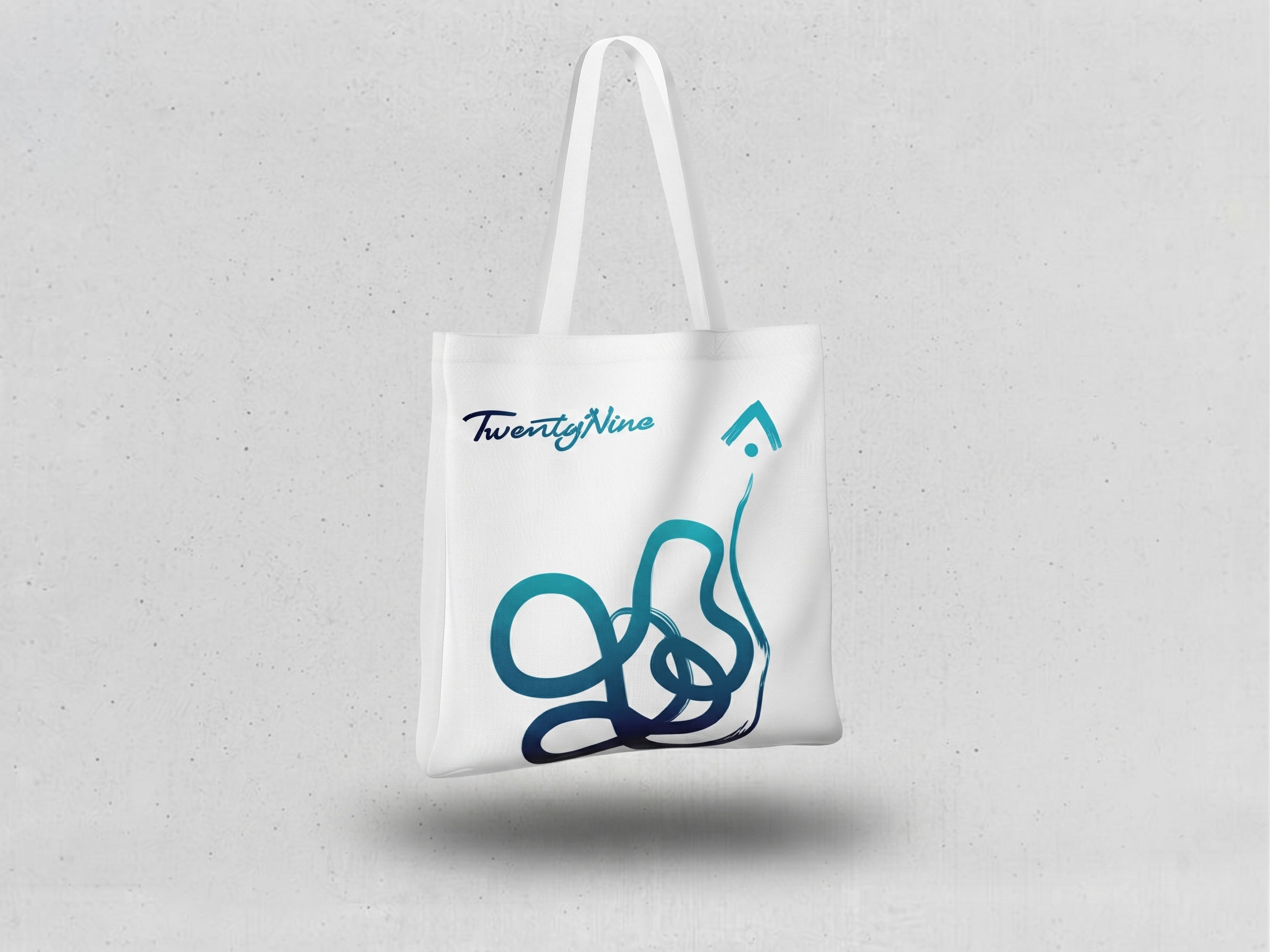
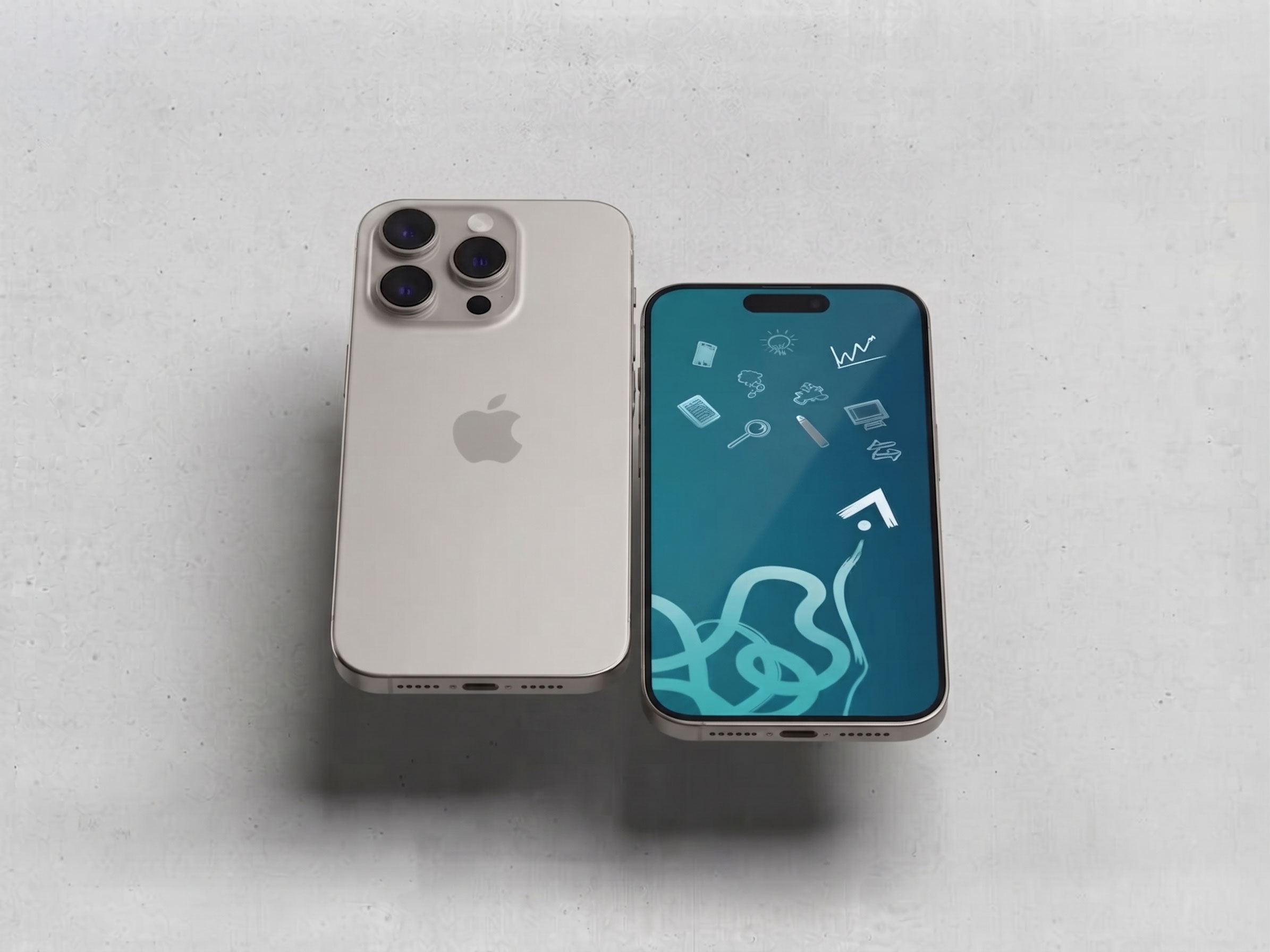
The final identity was applied across print, digital and marketing materials to create a consistent experience at every touchpoint. From business cards to merchandise, the new brand reflects TwentyNine’s strategic, modern and confident direction.
Digital Evolution
I used AI to explore a new visual language for TwentyNine - turning its “Partners in Crime” idea into a bold chess-inspired world built to catch attention.
01. Evolving the Digital Experience
From Website to Digital Personality
As our audience evolved, so did the way we needed to communicate. We moved towards bolder headlines, less text and more personality – while exploring how a distinctive mascot could make the brand more memorable in an increasingly AI-driven digital landscape.
02. Mascot Exploration
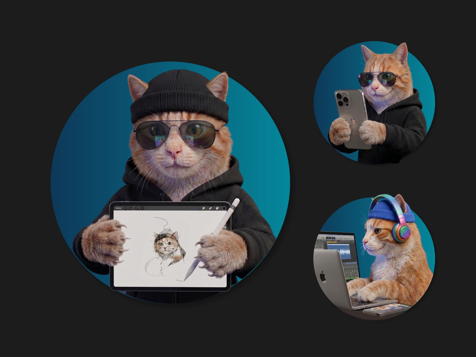
The Cat
A natural starting point was that the agency already had a cat, so using our own animal felt authentic. But the direction leaned too cute and individualistic, making it less suitable for a broader audience and missing the collaborative “partner in crime” spirit we wanted to express.
Rejected, because the idea was missing the collaborative “partner in crime” spirit.
03. Mascot Exploration
The Wolf Pack
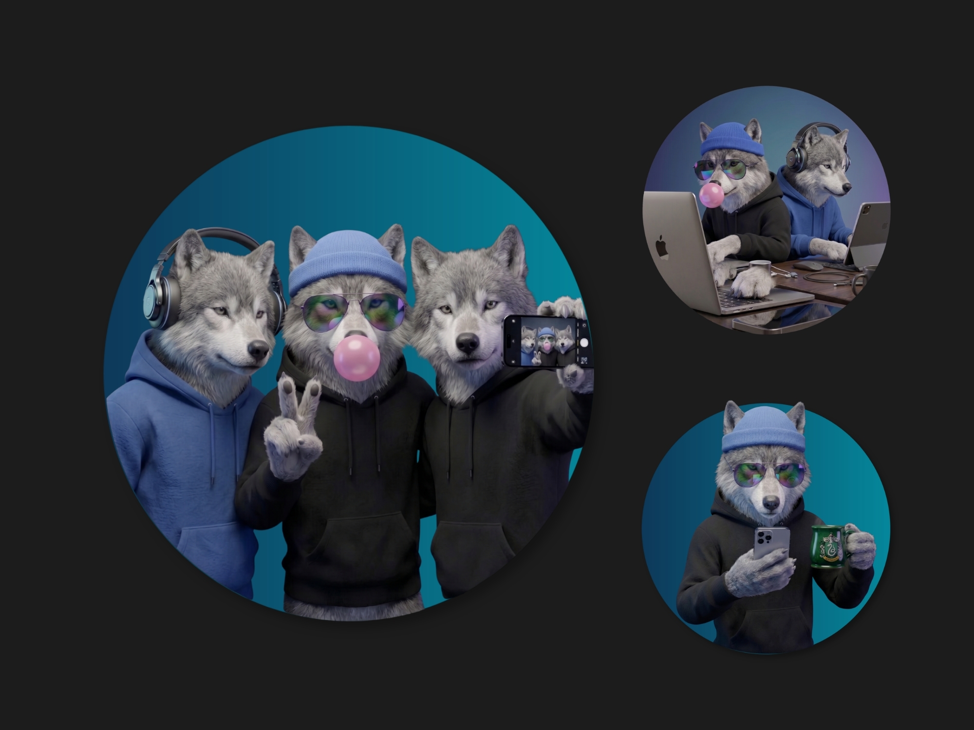
Wolves naturally represented the ideas we wanted to communicate: community, belonging and the “partner in crime” mentality while also speaking strongly to our target audience. However the symbol sometimes felt too aggressive, with strong associations across crypto, fitness and other male-focused brands. It felt right conceptually, but not distinctive enough for TwentyNine.
Rejected, because the strategic fit wasn’t strong enough visually.
04. Mascot Exploration
The Classics
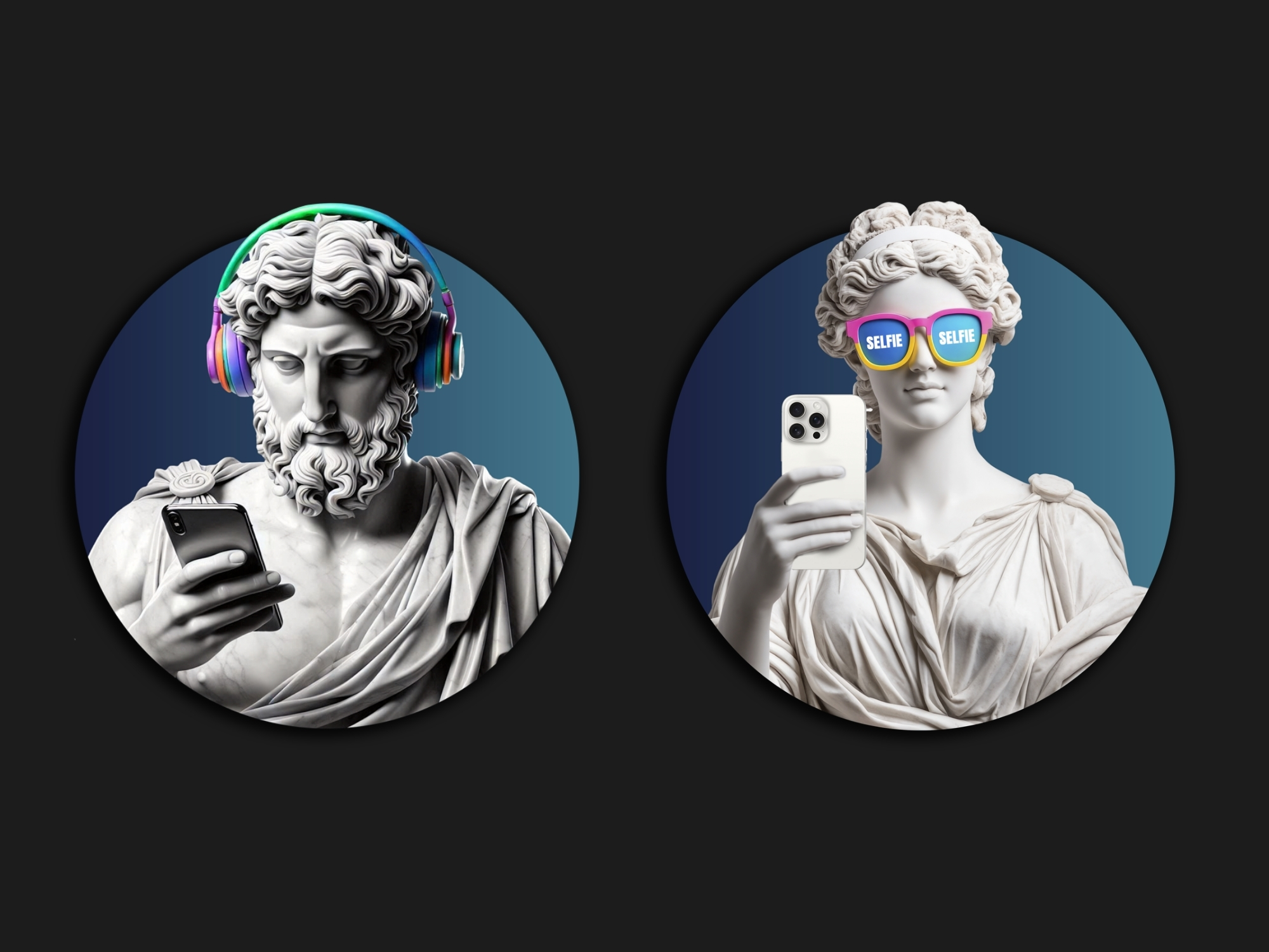
We played with the idea of bringing classical figures into the digital age, a playful way to show that even ancient characters could embrace modern technology. It had personality and humour, but the concept felt too familiar and had already been explored extensively by other brands. Fun, but not distinctive enough for TwentyNine.
Rejected, because it wasn’t distinctive enough.
05. Strategy Meets Personality
The Chess Direction
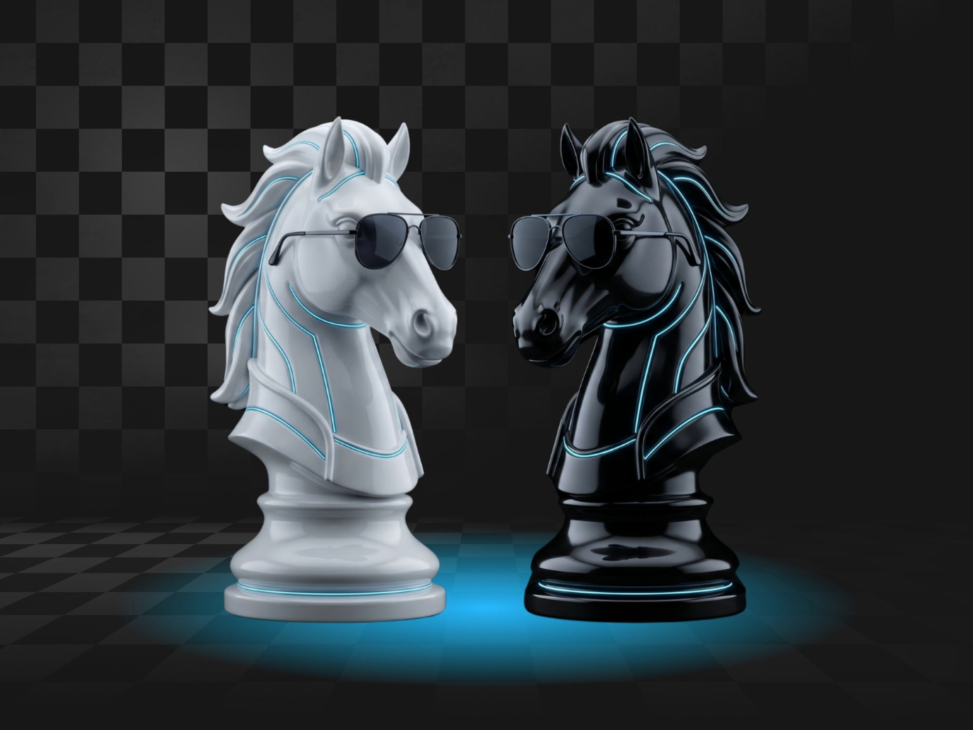
Chess became the strongest fit for TwentyNine because it brought together everything we wanted the digital identity to communicate: strategy, intelligence, collaboration and the drive to achieve a goal together. It also offered a more distinctive alternative to the familiar mascot directions we explored, while giving the brand a playful but sophisticated visual language. The concept had a personal connection for me as a designer, as well, since chess is part of my everyday life.
Accepted idea, because it is unique and reflects TwentyNine brand well.
06. From Concept to Character
The Concept Was Clear. Making It Feel Right Was the Challenge.
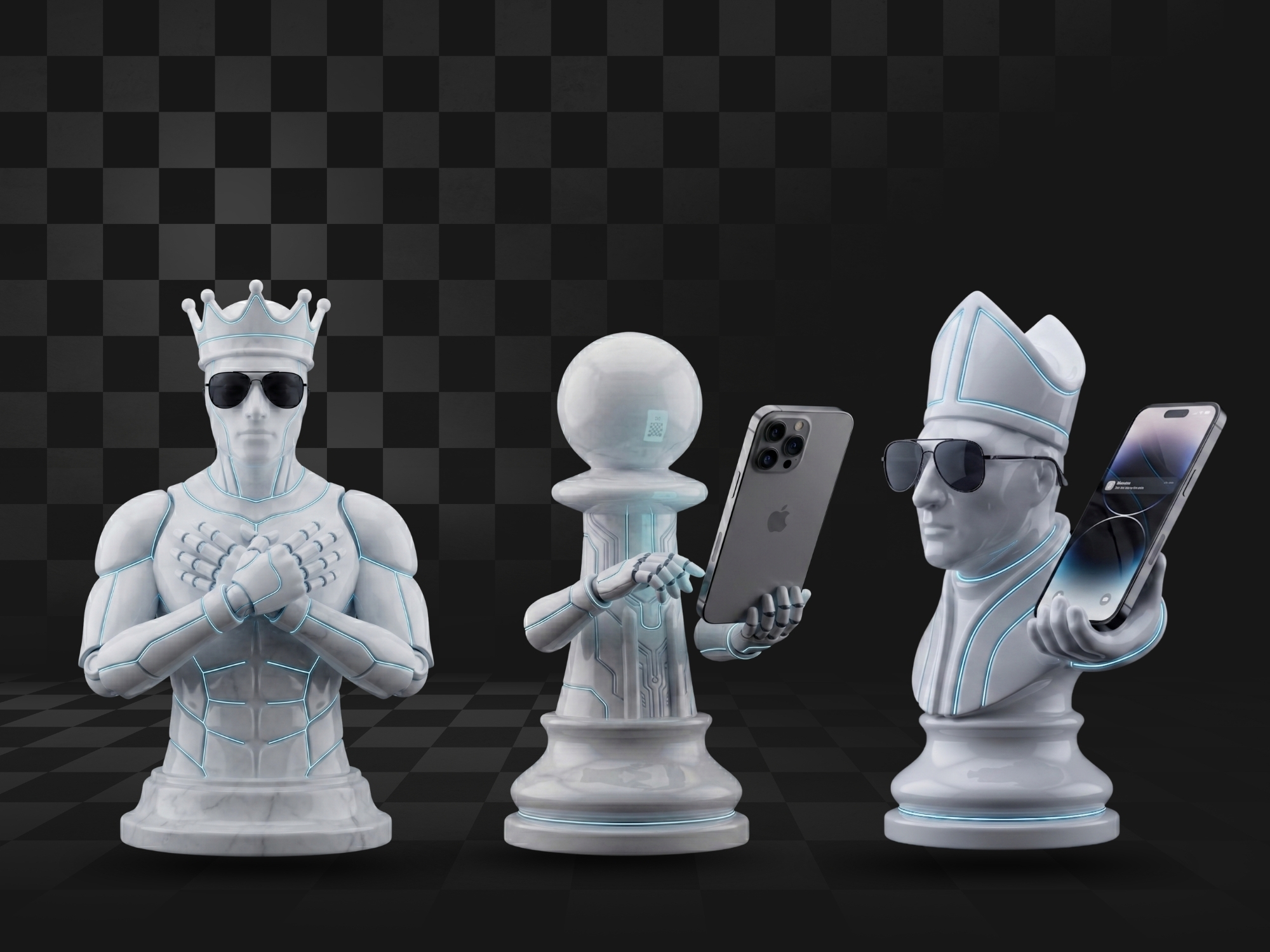
Creating the chess characters required extensive exploration and refinement. Many early generations felt too strange, intimidating or visually inconsistent, so I tested different styles, poses and personalities until the characters felt approachable, modern and aligned with the TwentyNine brand.
07. A Visual System, Not Just a Mascot
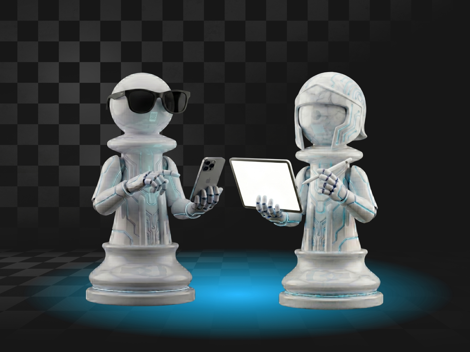
From Concept to Characters
Once the direction felt right, we turned the concept into a flexible visual system. We created 10 unique chess characters and poses that could be mixed, reused and adapted across the website and future digital applications giving TwentyNine a playful, recognisable visual language that could keep evolving.
08. Bolder. Faster. More Digital.
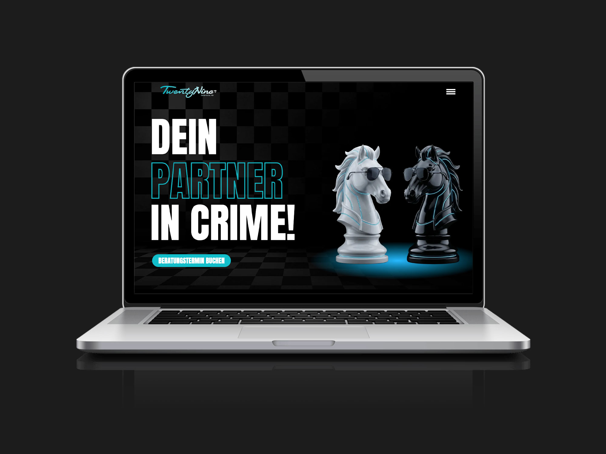
Website – Bringing the New Personality Online
The new direction translated into a more vibrant, mobile-first experience. We moved towards larger typography, stronger visual moments and shorter, more engaging content — giving the website the confidence and energy of the new TwentyNine brand.
09. The System in Action
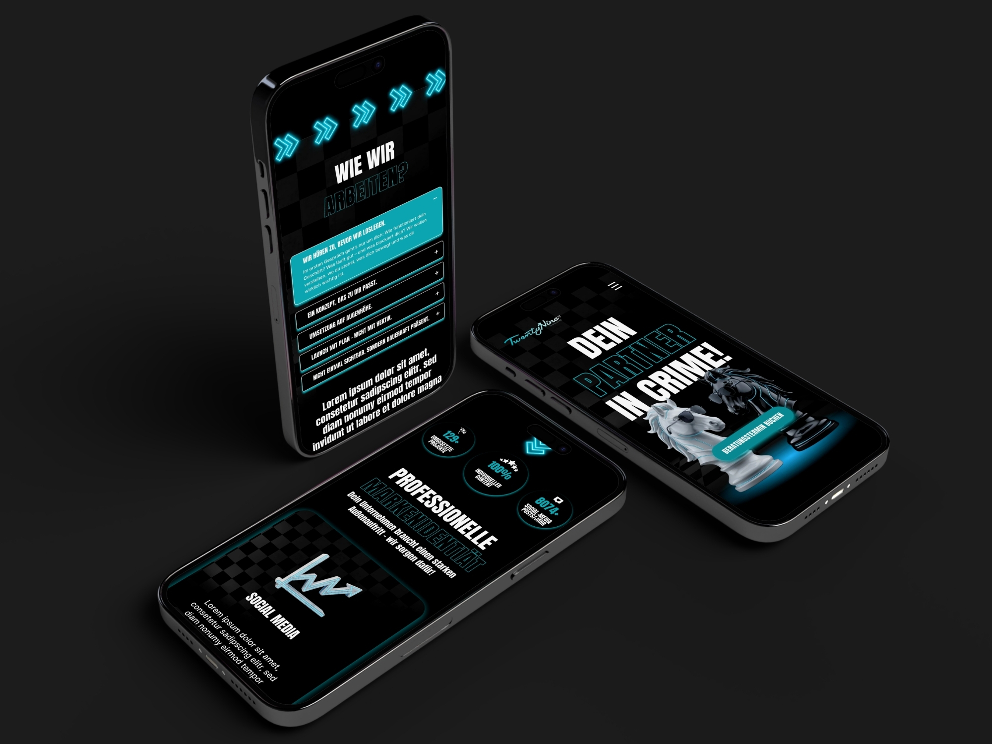
A Digital Experience Built Around the Brand
The chess characters, bold typography and visual language come together across the website to create a more recognisable and engaging experience – designed to work seamlessly from mobile to desktop.
Feedback
Ernesta verfügte über ein äußerst umfassendes und stets aktuelles Fachwissen, das sie jederzeit sicher und außerordentlich erfolgreich in der Praxis einsetzte. Sie verband hervorragende gestalterische Fähigkeiten mit einem ausgeprägten technischen Verständnis und einem sehr sicheren Gespür für Marken, Zielgruppen und zeitgemäße digitale Kommunikation.
Stefanie
Geschäftsführung, TwentyNine GmbH & Co. KG
In a Nutshell
- Discovery Workshops
- Brand Vision Alignment
- Concept Exploration
- Creative Direction
- Feedback & Iteration
- Brand Identity Design
- UX/UI Design
- Design Systems
- AI-Directed Illustrations
- Responsive Design

Outcome
A brand that grew up without losing its personality.
The result is a bolder, more confident TwentyNine - combining a cohesive visual identity with a playful digital language, strategic thinking and a flexible character system built for future growth.